
PI Industries
Rebranding a science-led innovator
Rebranding a science-led innovator

ROLE
Lead Brand Designer
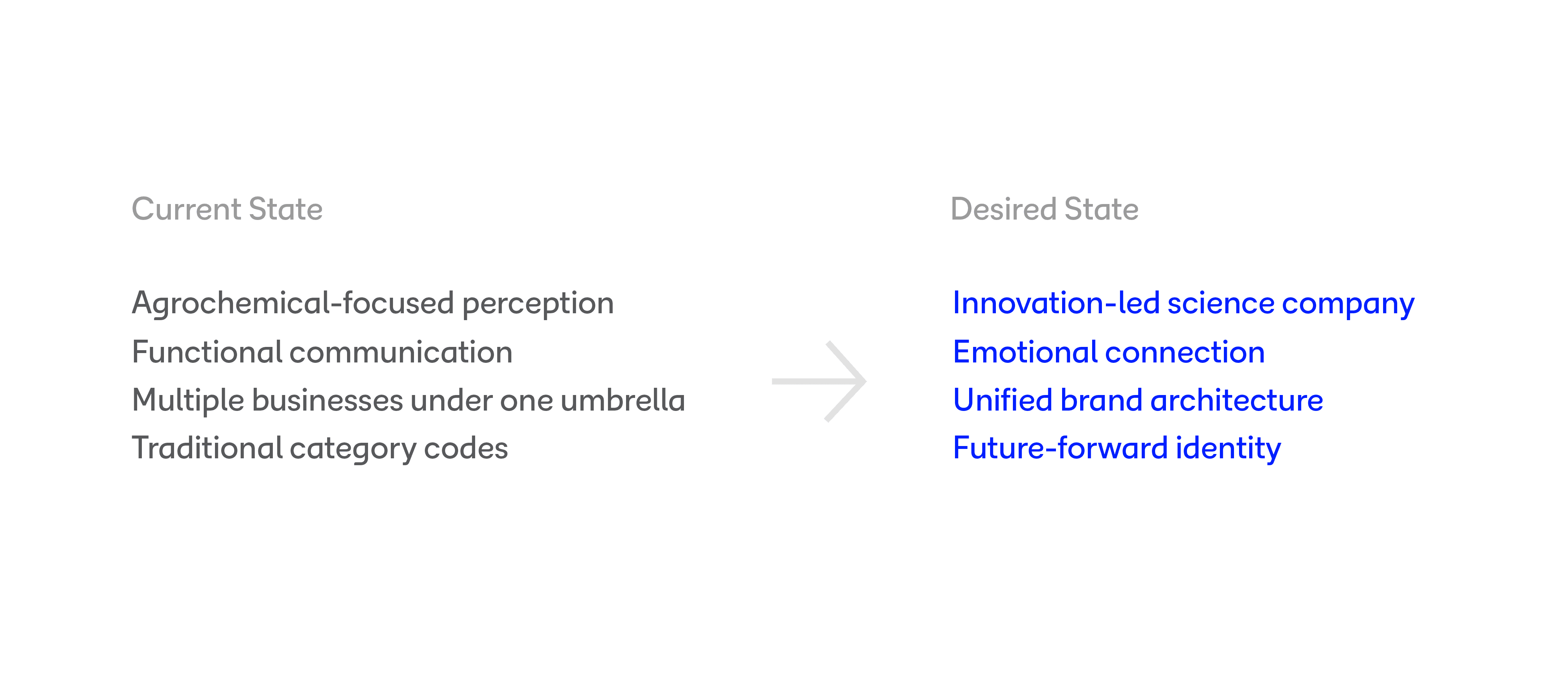
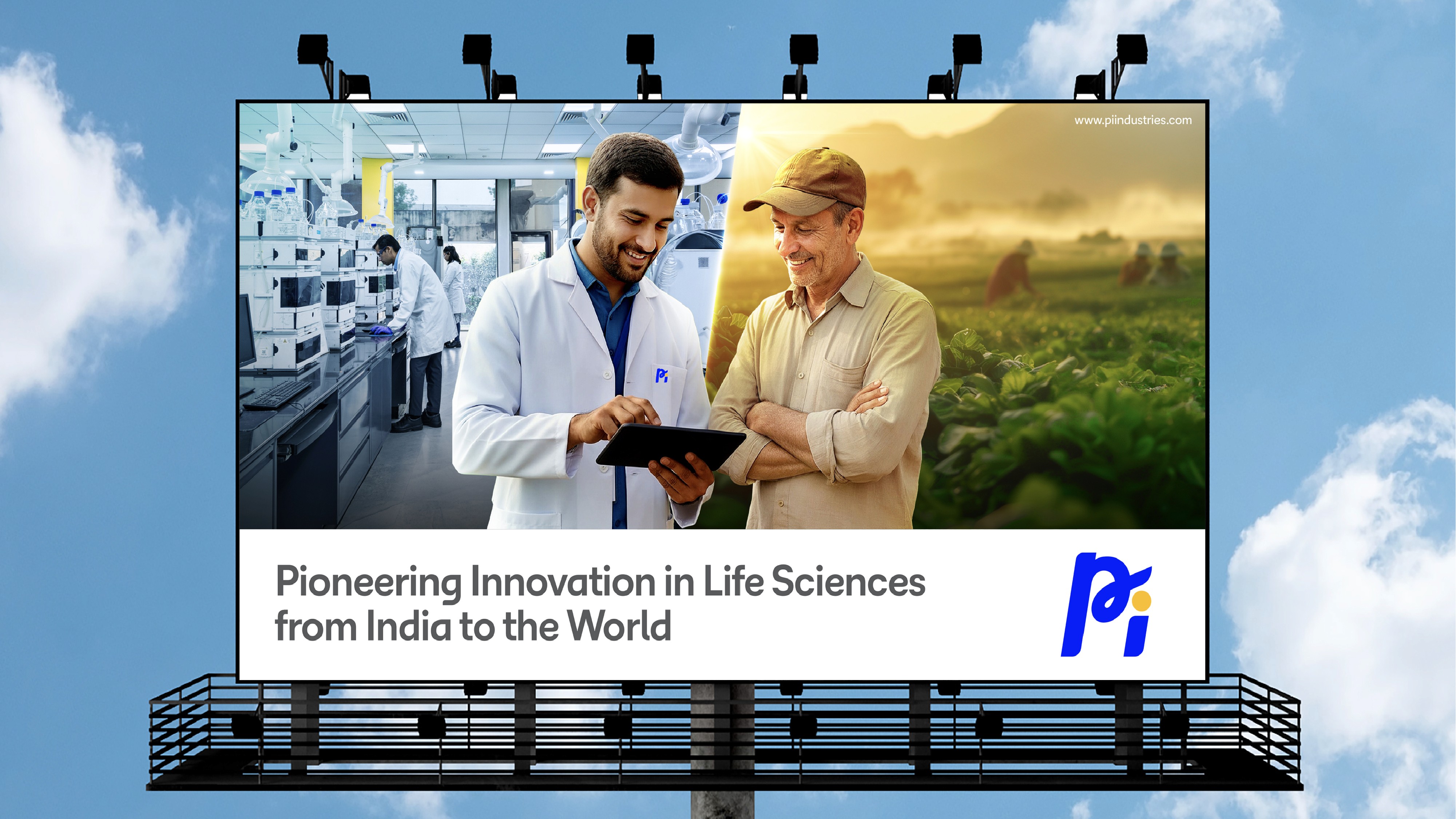
With a legacy spanning over 80 years, PI Industries has evolved into a high tech Global Life Sciences organization today. The brand refresh was envisioned as a natural progression, aligning its visual identity with its innovation-led reality while honoring its strong heritage. Anchored in the ambition of “India to the World,” the rebranding approach was driven by Intelligent Simplification, reframing the brand from a legacy perception to a research led, innovation first narrative. Beyond the logo redesign, the challenge was to build a corporate identity that balances scientific rigor with clarity while making complex innovation accessible through a human lens. It also aimed to reflect its R&D depth and global ambitions while retaining established credibility.
THE CHALLENGE
The existing brand carried strong equity but was largely perceived through a traditional industry lens. PI needed an identity that could balance scientific credibility with human optimism, creating a cohesive system that would work across corporate communications, workplace environments, digital experiences, and future business growth.
WHAT I DID
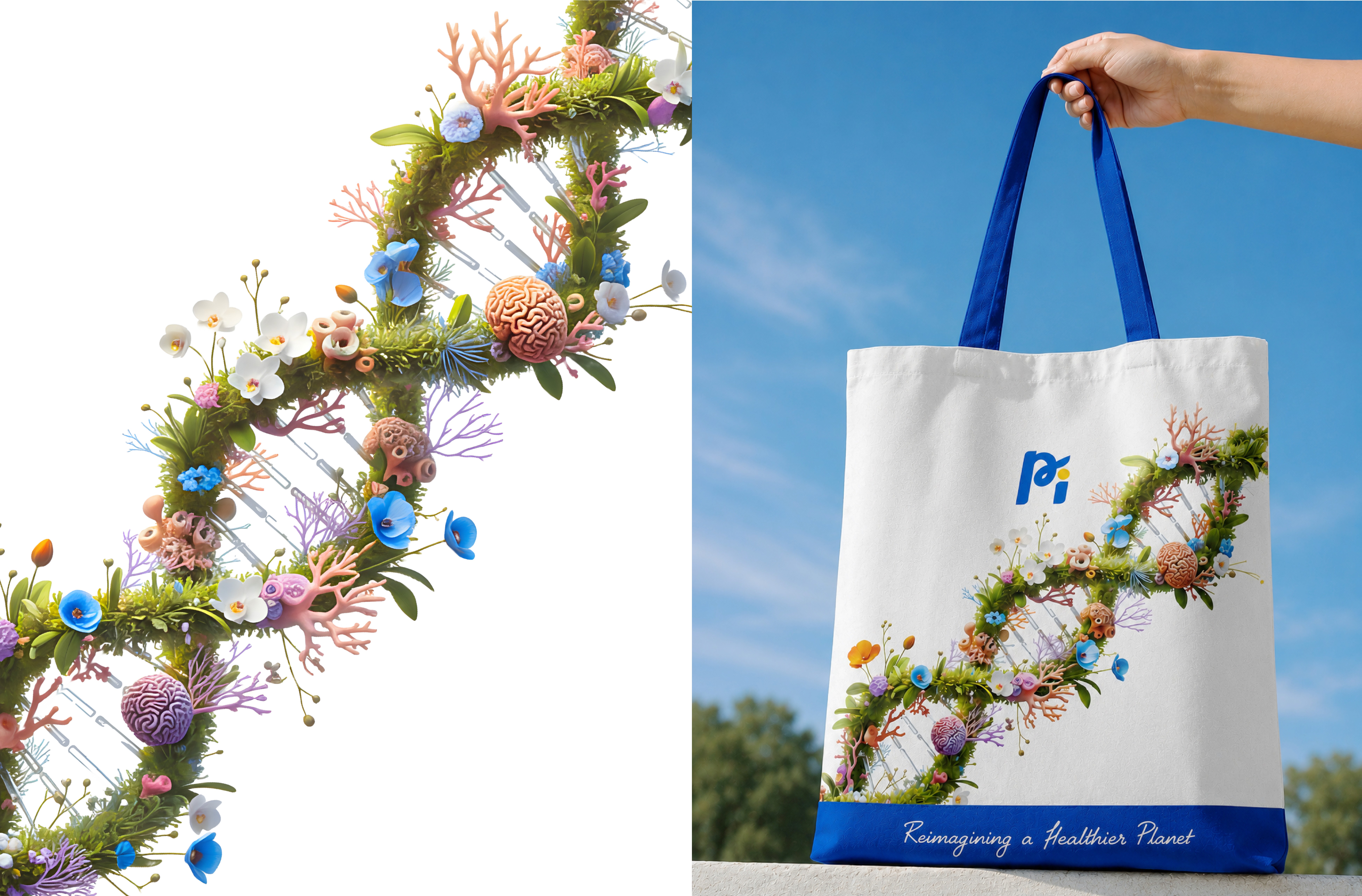
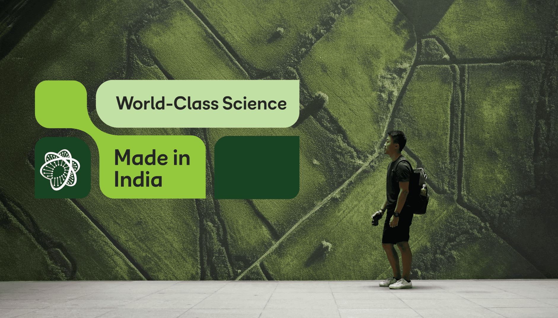
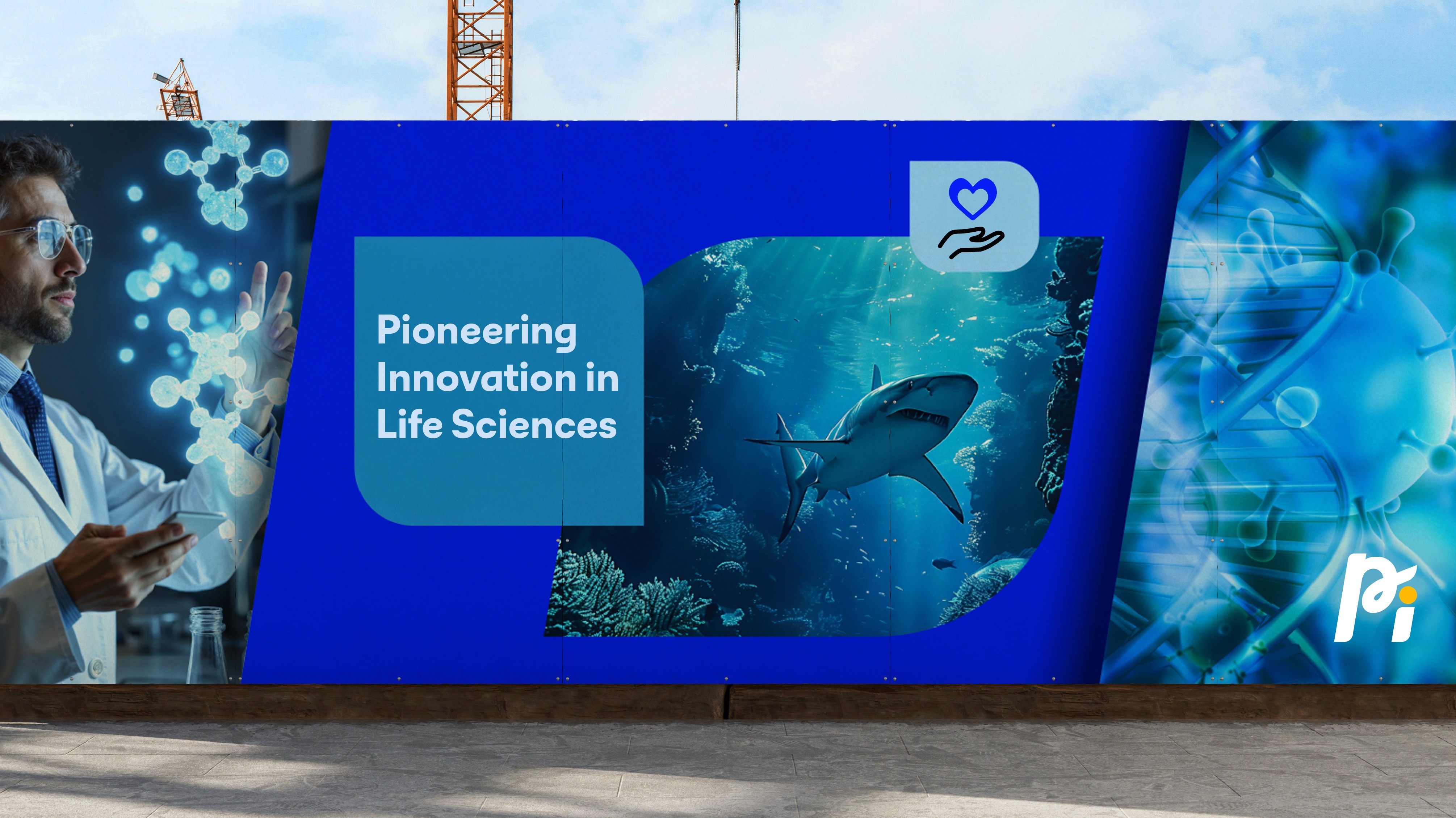
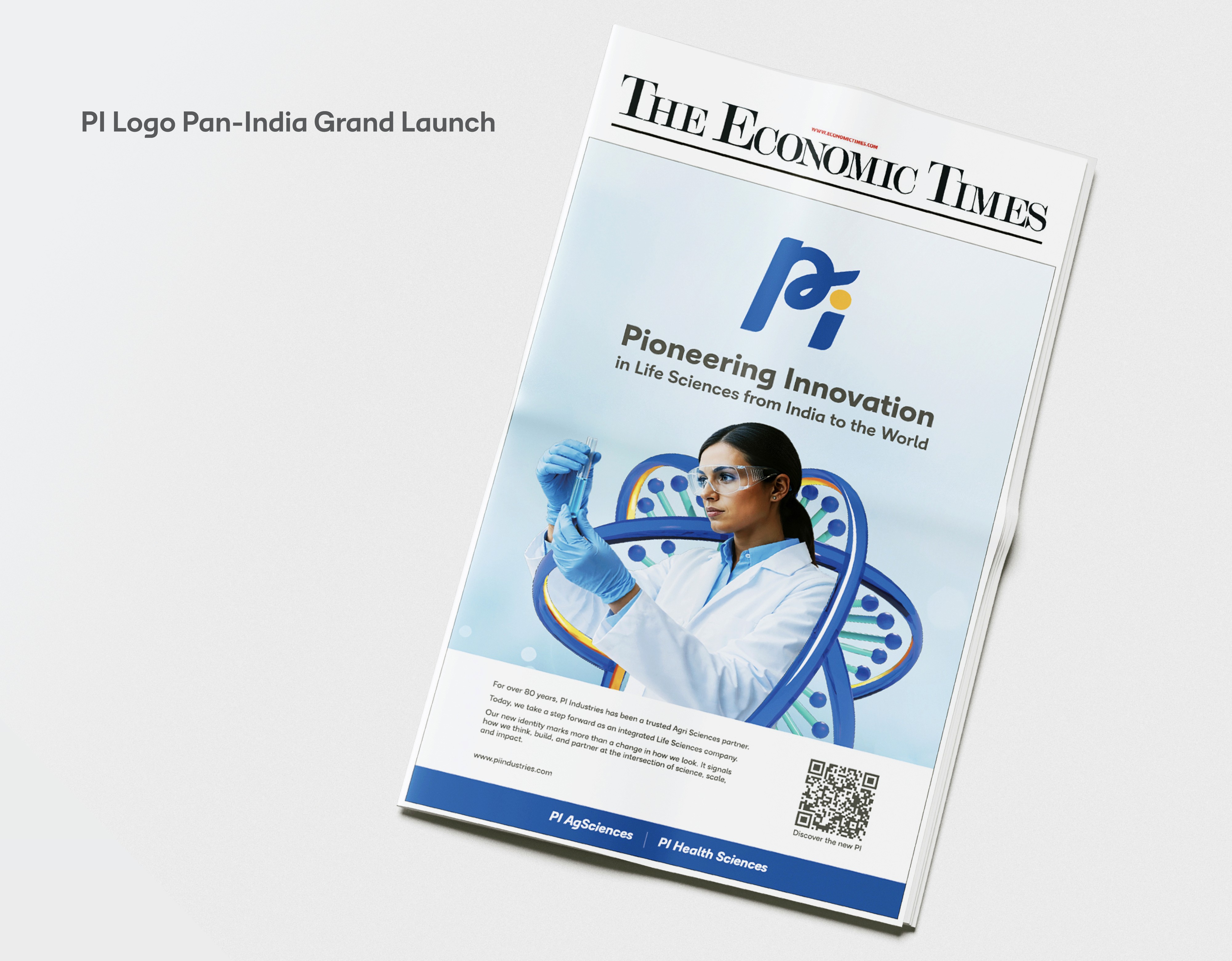
I led the rebranding process from strategy to execution, developing a comprehensive identity system that redefined how PI presents itself across every touchpoint. This included brand positioning, visual identity development, graphic language creation, environmental branding, and the design of detailed brand guidelines. The result was a scalable 360° brand ecosystem built around the idea of interconnected growth, innovation, and a healthier planet.
From Exploration
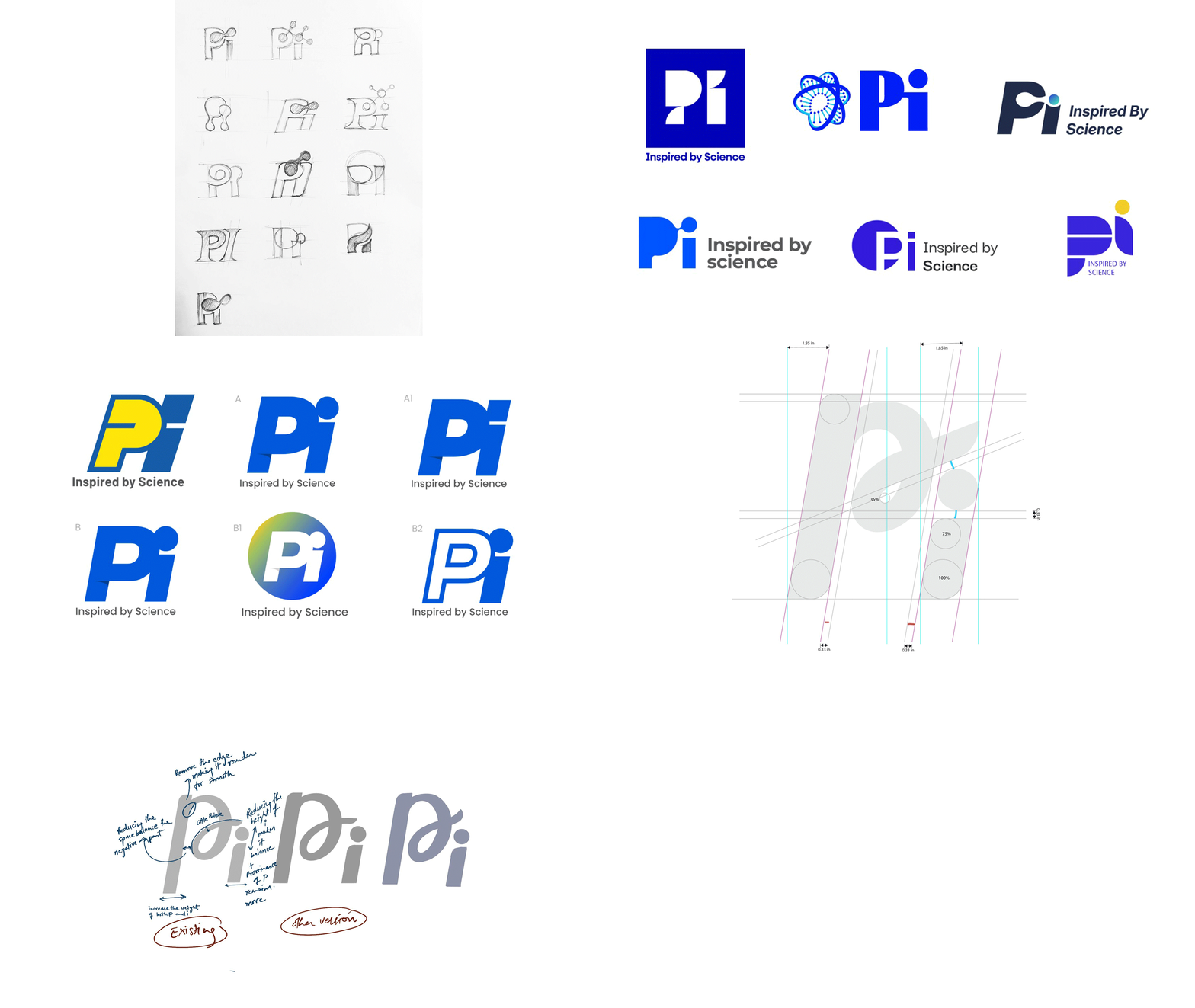
to Expression
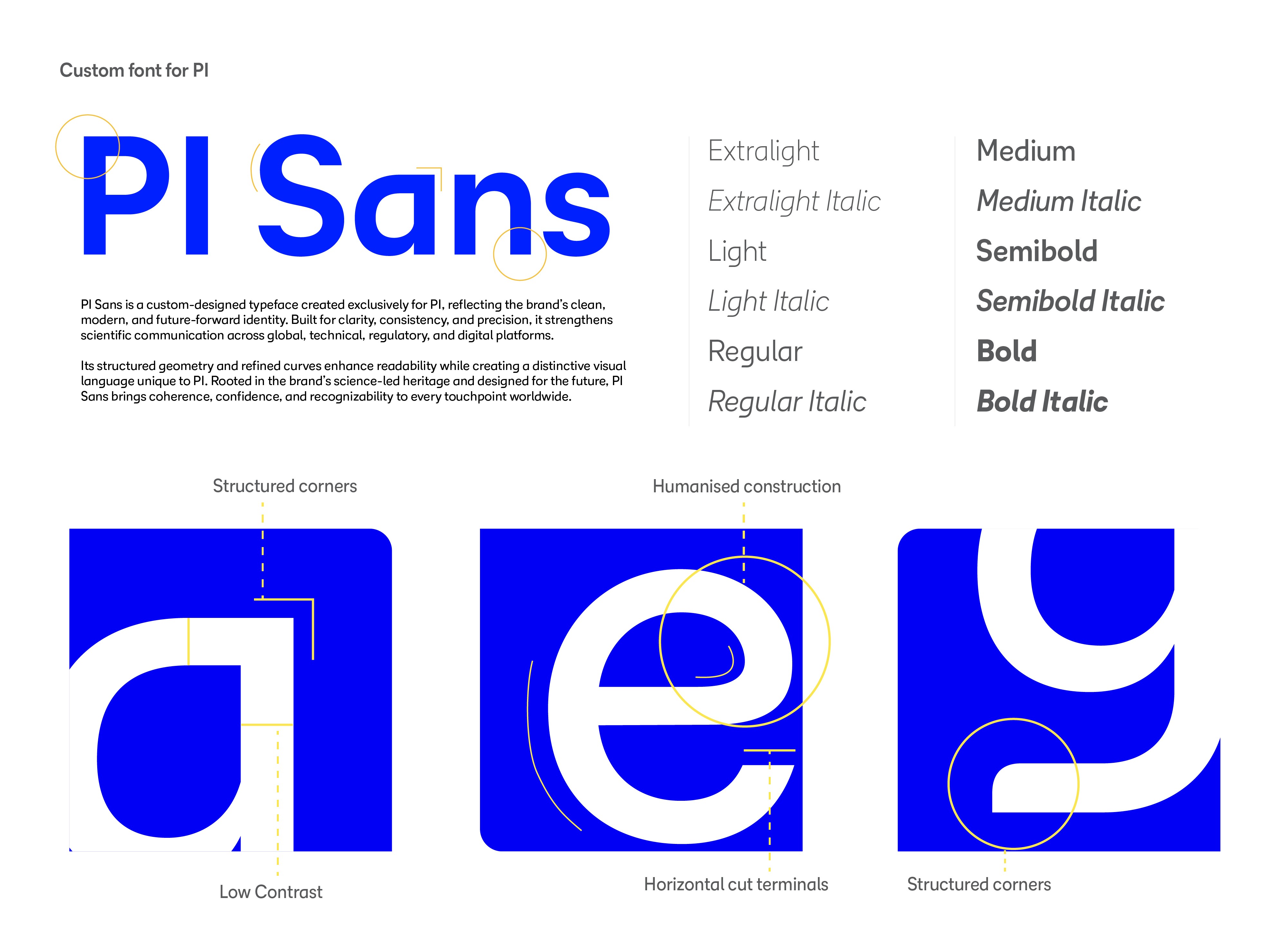
Science behind the identity


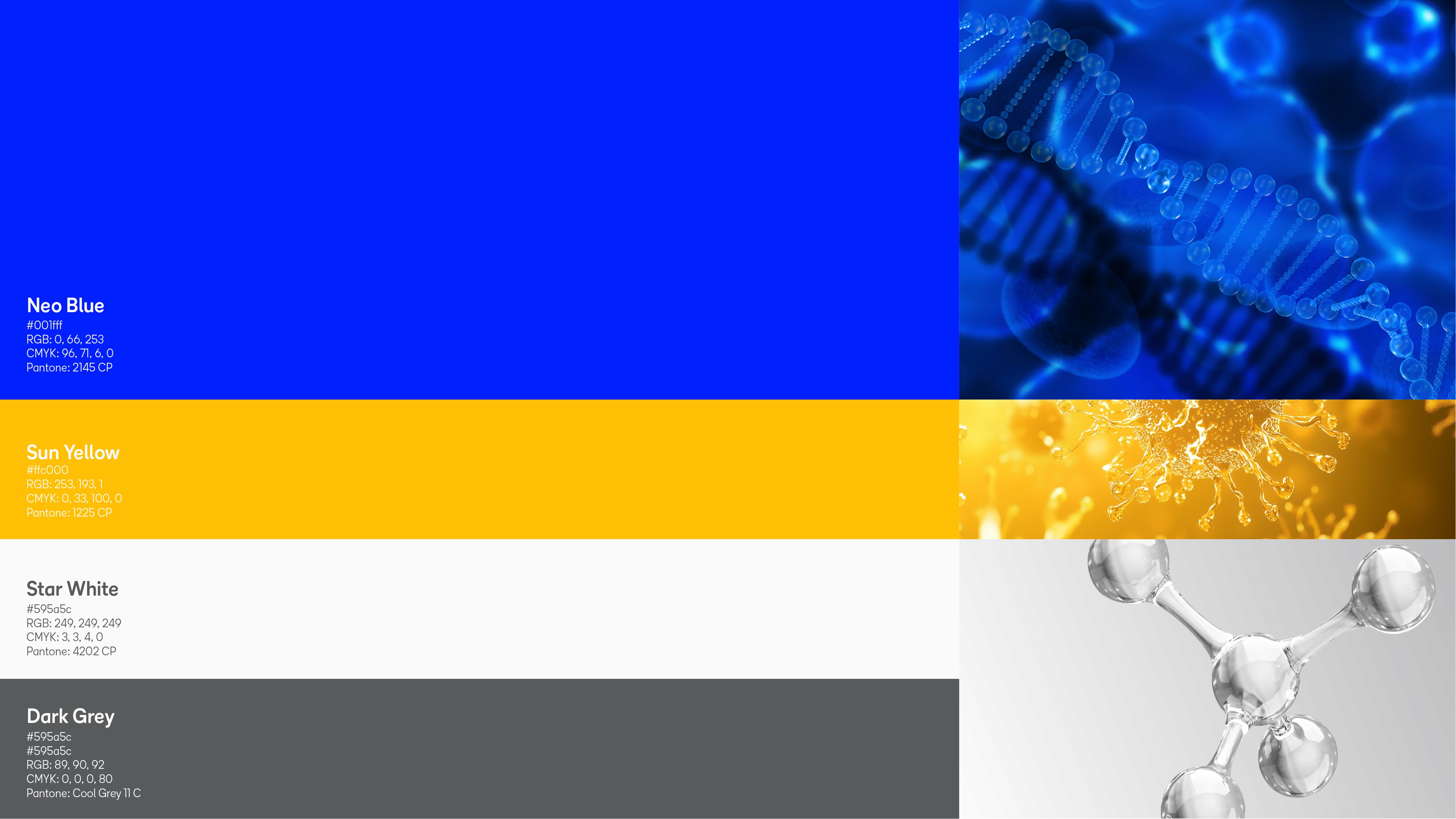
Core Colours

Designed to Expand
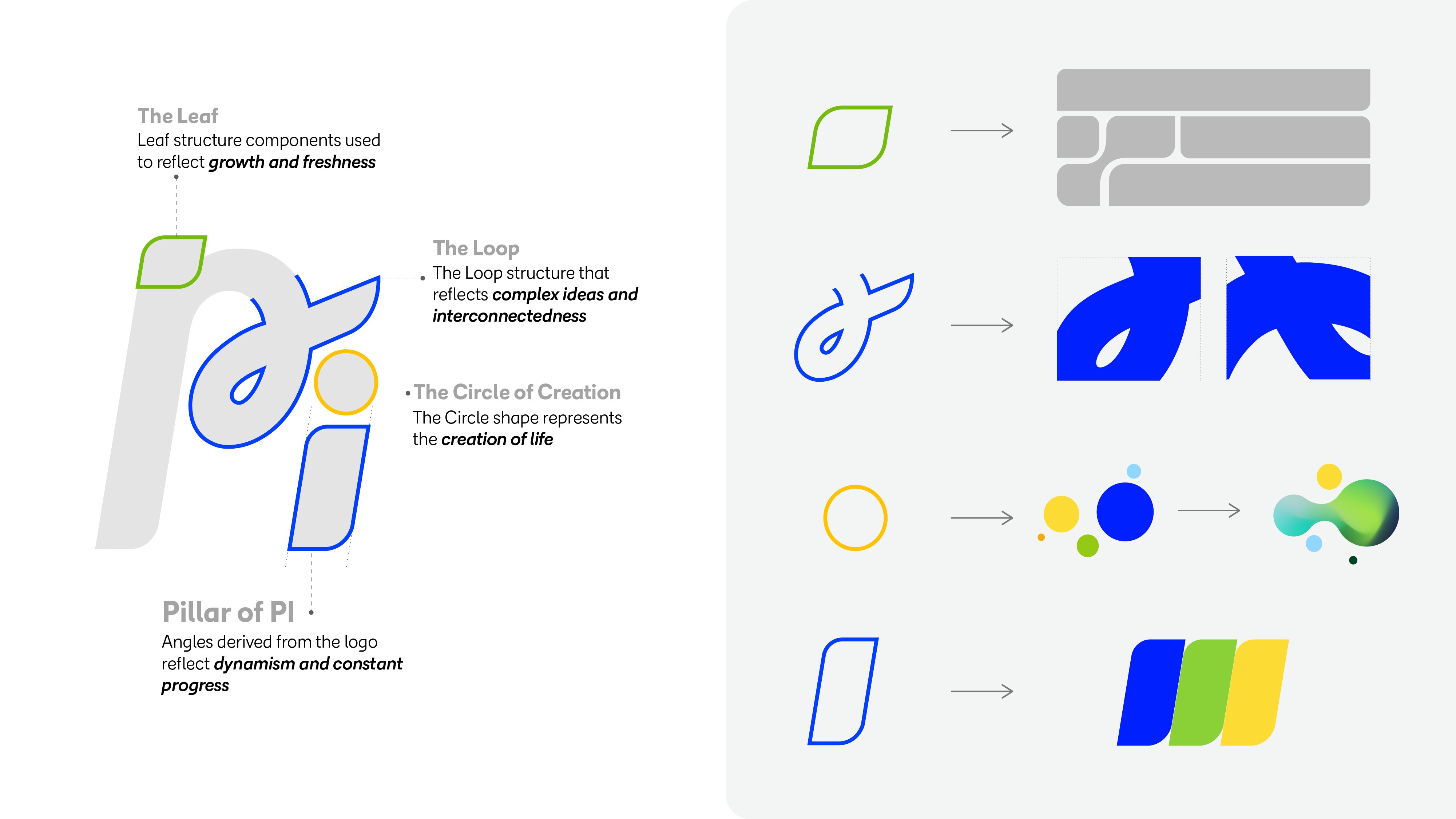
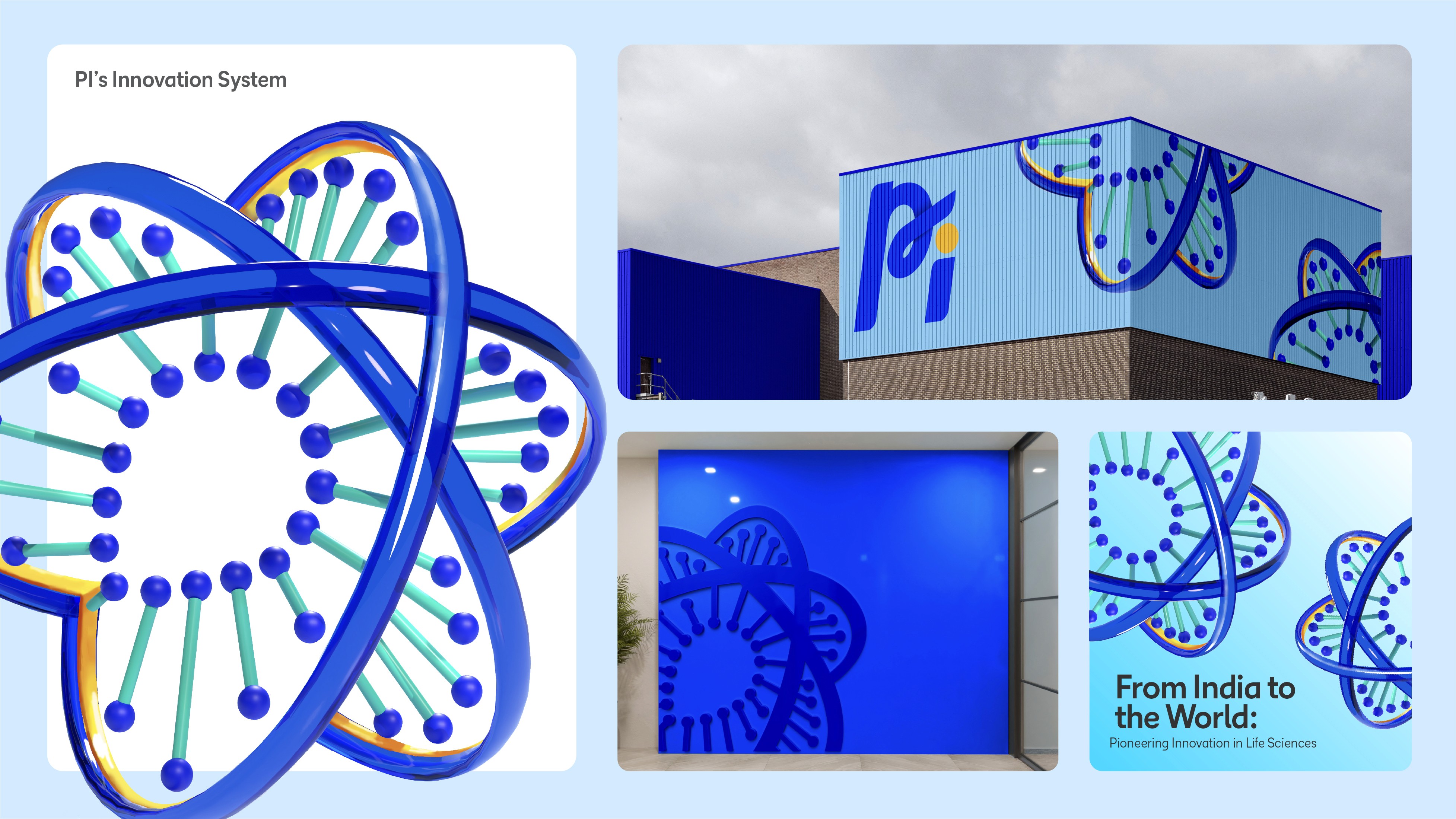
The elements in the PI graphic system originate from the logo itself. By extracting and reinterpreting its curves, cuts, and distinctive forms, a single mark expands into a versatile visual system.
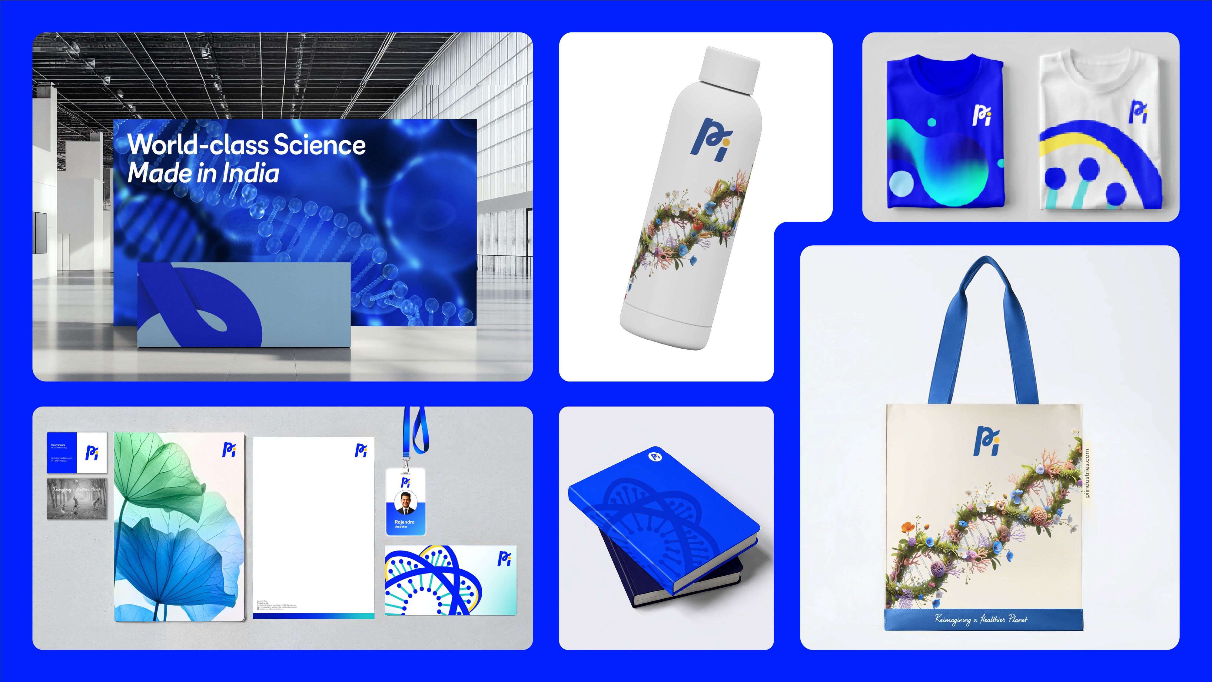
These shapes are not decorative, they are intentional extensions of the identity. They scale, rotate, and recombine to create patterns, frames, and moments of emphasis, ensuring that every expression remains rooted in the brand.
What begins as one symbol evolves into a dynamic design language, consistent at its core, yet flexible in its application.
Application
The GRAND Launch event
Rebranding a science-led innovator
ROLE
Lead Brand Designer
With a legacy spanning over 80 years, PI Industries has evolved into a high tech Global Life Sciences organization today. The brand refresh was envisioned as a natural progression, aligning its visual identity with its innovation-led reality while honoring its strong heritage. Anchored in the ambition of “India to the World,” the rebranding approach was driven by Intelligent Simplification, reframing the brand from a legacy perception to a research led, innovation first narrative. Beyond the logo redesign, the challenge was to build a corporate identity that balances scientific rigor with clarity while making complex innovation accessible through a human lens. It also aimed to reflect its R&D depth and global ambitions while retaining established credibility.
THE CHALLENGE
The existing brand carried strong equity but was largely perceived through a traditional industry lens. PI needed an identity that could balance scientific credibility with human optimism, creating a cohesive system that would work across corporate communications, workplace environments, digital experiences, and future business growth.
WHAT I DID
I led the rebranding process from strategy to execution, developing a comprehensive identity system that redefined how PI presents itself across every touchpoint. This included brand positioning, visual identity development, graphic language creation, environmental branding, and the design of detailed brand guidelines. The result was a scalable 360° brand ecosystem built around the idea of interconnected growth, innovation, and a healthier planet.
From Exploration
to Expression
Science behind the identity
Core Colours
Designed to Expand
The elements in the PI graphic system originate from the logo itself. By extracting and reinterpreting its curves, cuts, and distinctive forms, a single mark expands into a versatile visual system.
These shapes are not decorative, they are intentional extensions of the identity. They scale, rotate, and recombine to create patterns, frames, and moments of emphasis, ensuring that every expression remains rooted in the brand.
What begins as one symbol evolves into a dynamic design language, consistent at its core, yet flexible in its application.
Application
The GRAND Launch event
Rebranding a science-led innovator
ROLE
Lead Brand Designer
With a legacy spanning over 80 years, PI Industries has evolved into a high tech Global Life Sciences organization today. The brand refresh was envisioned as a natural progression, aligning its visual identity with its innovation-led reality while honoring its strong heritage. Anchored in the ambition of “India to the World,” the rebranding approach was driven by Intelligent Simplification, reframing the brand from a legacy perception to a research led, innovation first narrative. Beyond the logo redesign, the challenge was to build a corporate identity that balances scientific rigor with clarity while making complex innovation accessible through a human lens. It also aimed to reflect its R&D depth and global ambitions while retaining established credibility.
THE CHALLENGE
The existing brand carried strong equity but was largely perceived through a traditional industry lens. PI needed an identity that could balance scientific credibility with human optimism, creating a cohesive system that would work across corporate communications, workplace environments, digital experiences, and future business growth.
WHAT I DID
I led the rebranding process from strategy to execution, developing a comprehensive identity system that redefined how PI presents itself across every touchpoint. This included brand positioning, visual identity development, graphic language creation, environmental branding, and the design of detailed brand guidelines. The result was a scalable 360° brand ecosystem built around the idea of interconnected growth, innovation, and a healthier planet.
From Exploration
to Expression
Science behind the identity
Core Colours
Designed to Expand
The elements in the PI graphic system originate from the logo itself. By extracting and reinterpreting its curves, cuts, and distinctive forms, a single mark expands into a versatile visual system.
These shapes are not decorative, they are intentional extensions of the identity. They scale, rotate, and recombine to create patterns, frames, and moments of emphasis, ensuring that every expression remains rooted in the brand.
What begins as one symbol evolves into a dynamic design language, consistent at its core, yet flexible in its application.
Application
The GRAND Launch event