
Sphere
A homegrown skateboard brand built for the next generation of Indian skateboarding.
A homegrown skateboard brand built for the next generation of Indian skateboarding.

ROLE
Brand Designer
Creative Director
Client: WeSkateCo
Industry: Sport
To support this vision, Sphere was introduced as a dedicated skateboard deck brand.
More than just a product line, Sphere was envisioned as a brand with its own identity, personality, and community appeal while remaining connected to the larger WeSkateCo ecosystem.
The challenge was to create a brand that felt energetic, expressive, and deeply rooted in skate culture while giving it a distinct voice that could resonate with both new and experienced skaters.
Sphere needed to exist in a difficult space.
It had to feel authentic to core skateboarders while remaining approachable for people entering the sport.
It had to stand confidently beside international skate brands while staying rooted in the local scene.
And most importantly:
It needed to feel like a skate brand first and a product brand second.
I led the brand identity design for Sphere.
My role involved defining how the brand should look, feel, and communicate across every touchpoint—from the logo and visual language to skateboard deck graphics and merchandise applications.
This included creating a flexible visual system, developing deck graphic concepts, establishing brand guidelines, and building a scalable identity that could grow alongside the skateboarding community.

The strongest skate brands don't sell products.
They sell belonging.
People remember:
The sticker on their first board
The deck graphic they obsessed over
The crew they skate with
The videos they grew up watching
The culture surrounding the sport
The product matters.
The culture matters more.
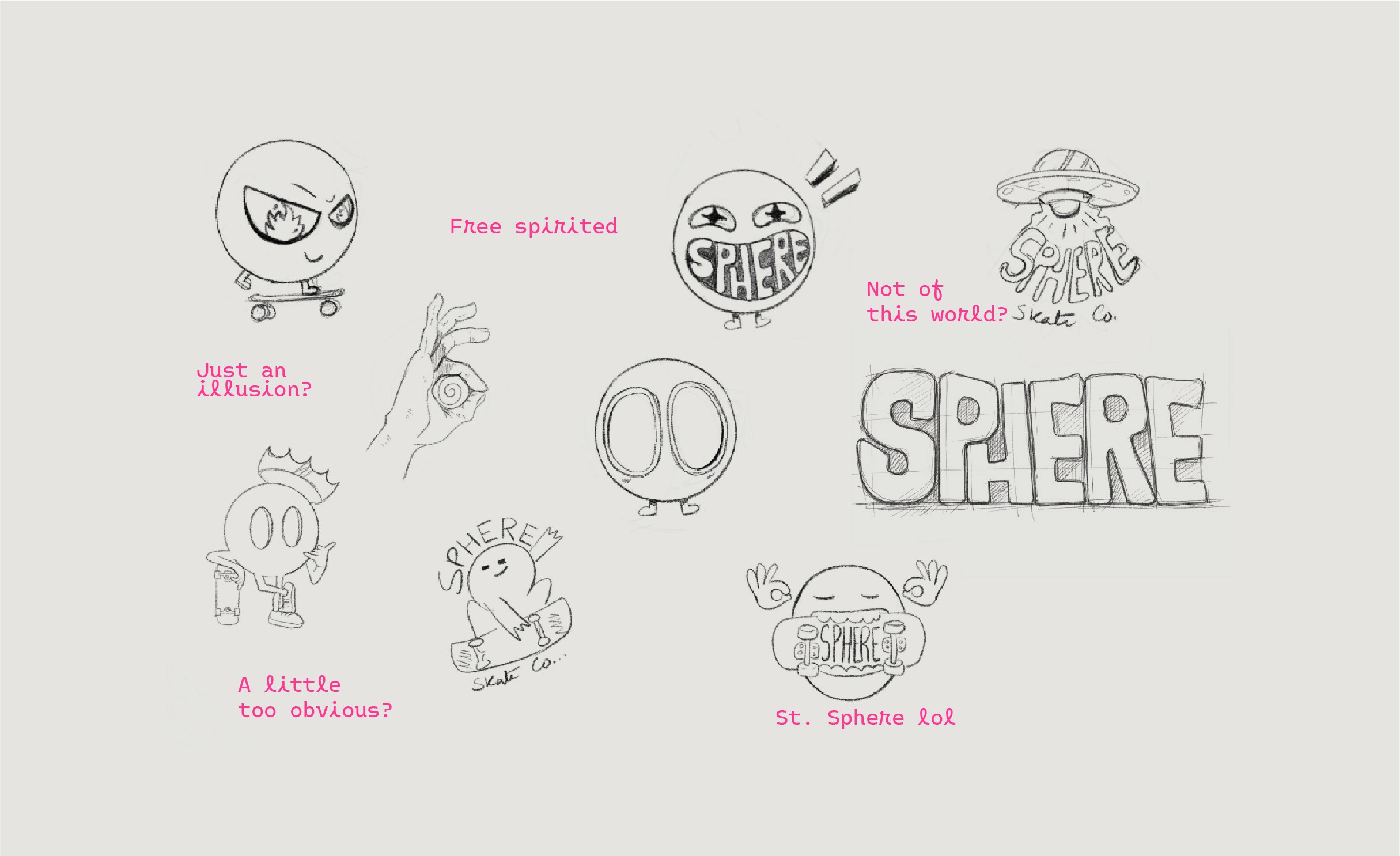
I explored several directions inspired by motion, progression, circular forms, and skate culture.
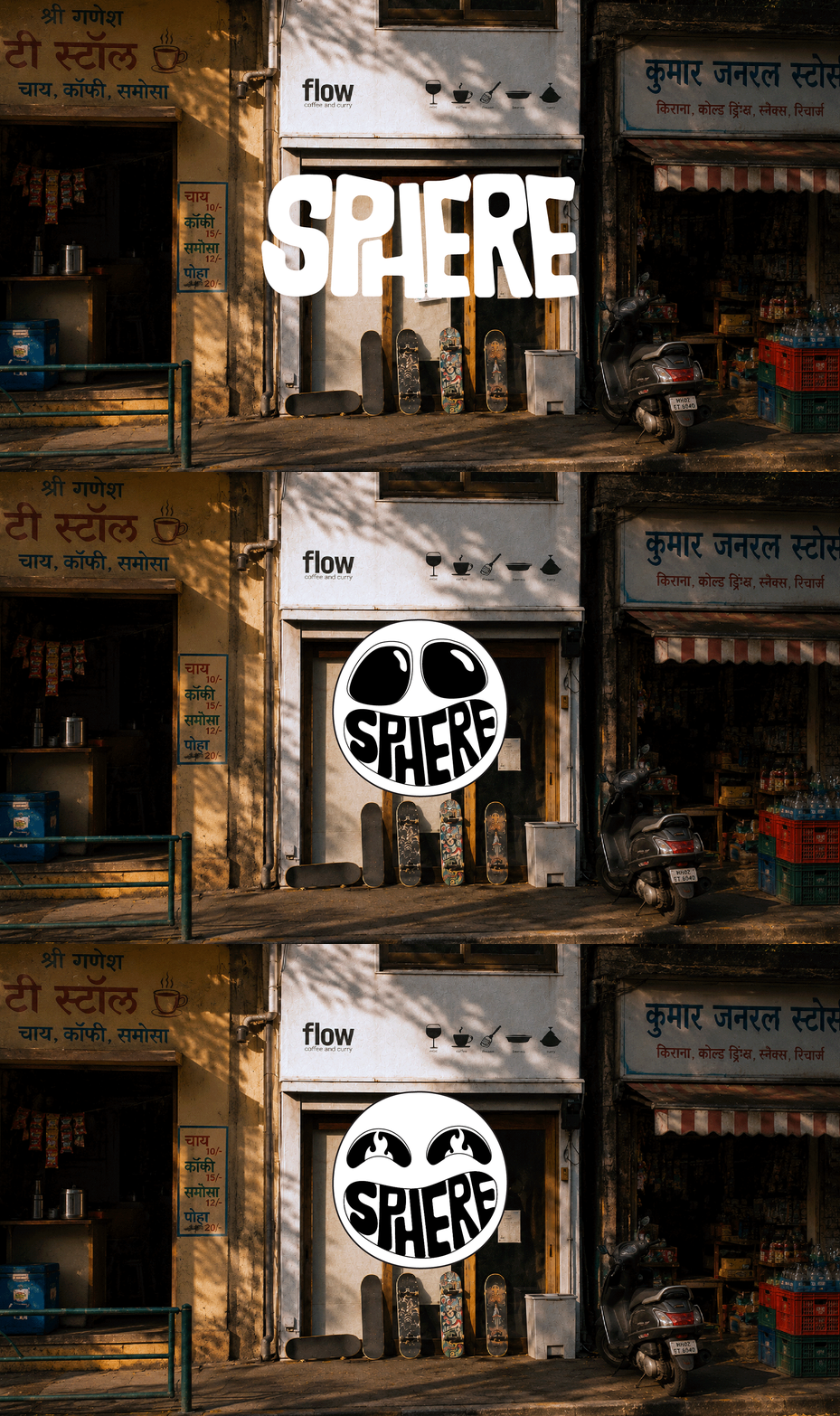
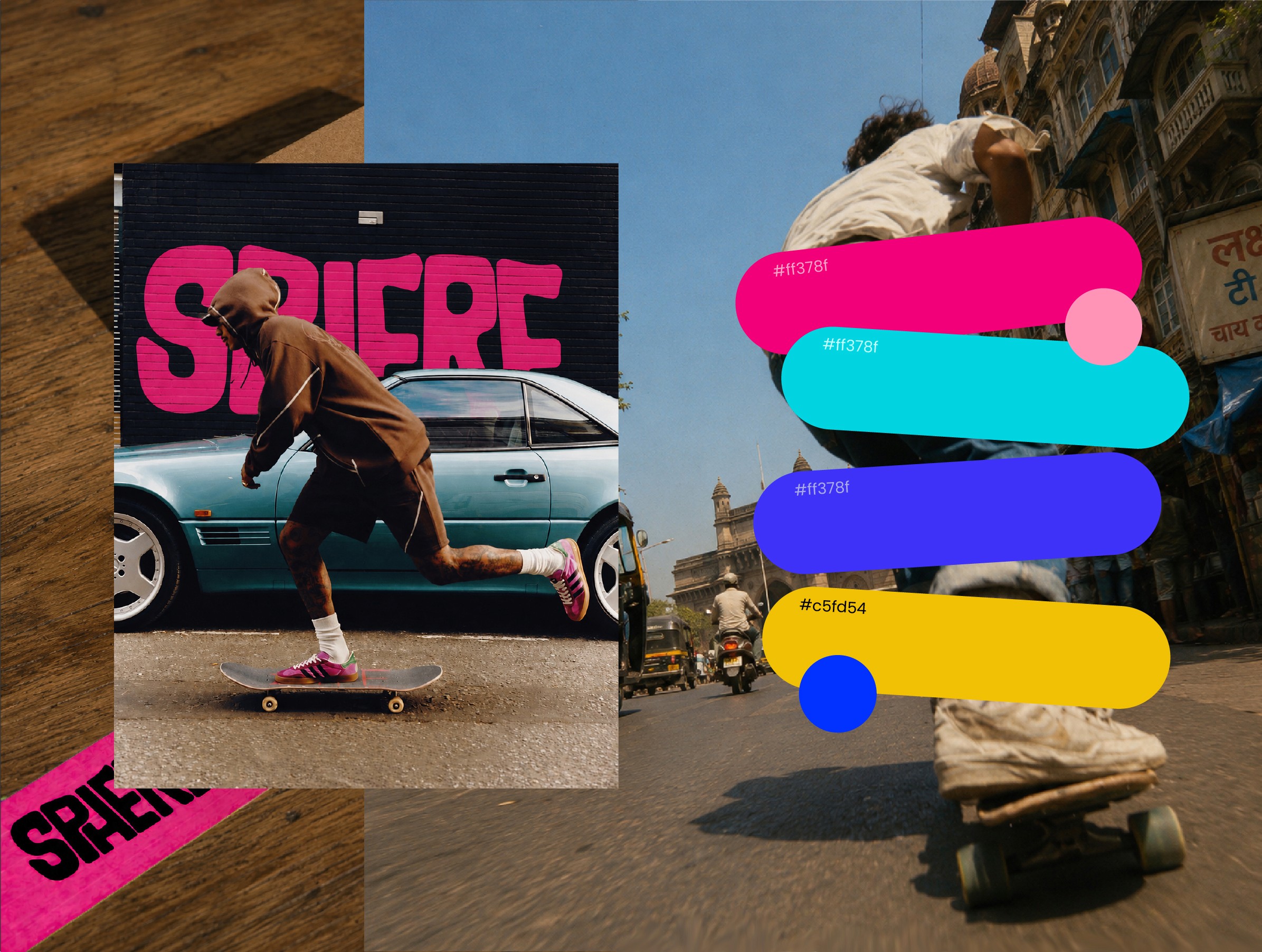

As the brand language evolved, it naturally expanded into a broader ecosystem under the WeSkate universe.
Toucan was introduced as a dedicated line of skateboard accessories, extending the same design philosophy into the essential components that complete every ride.
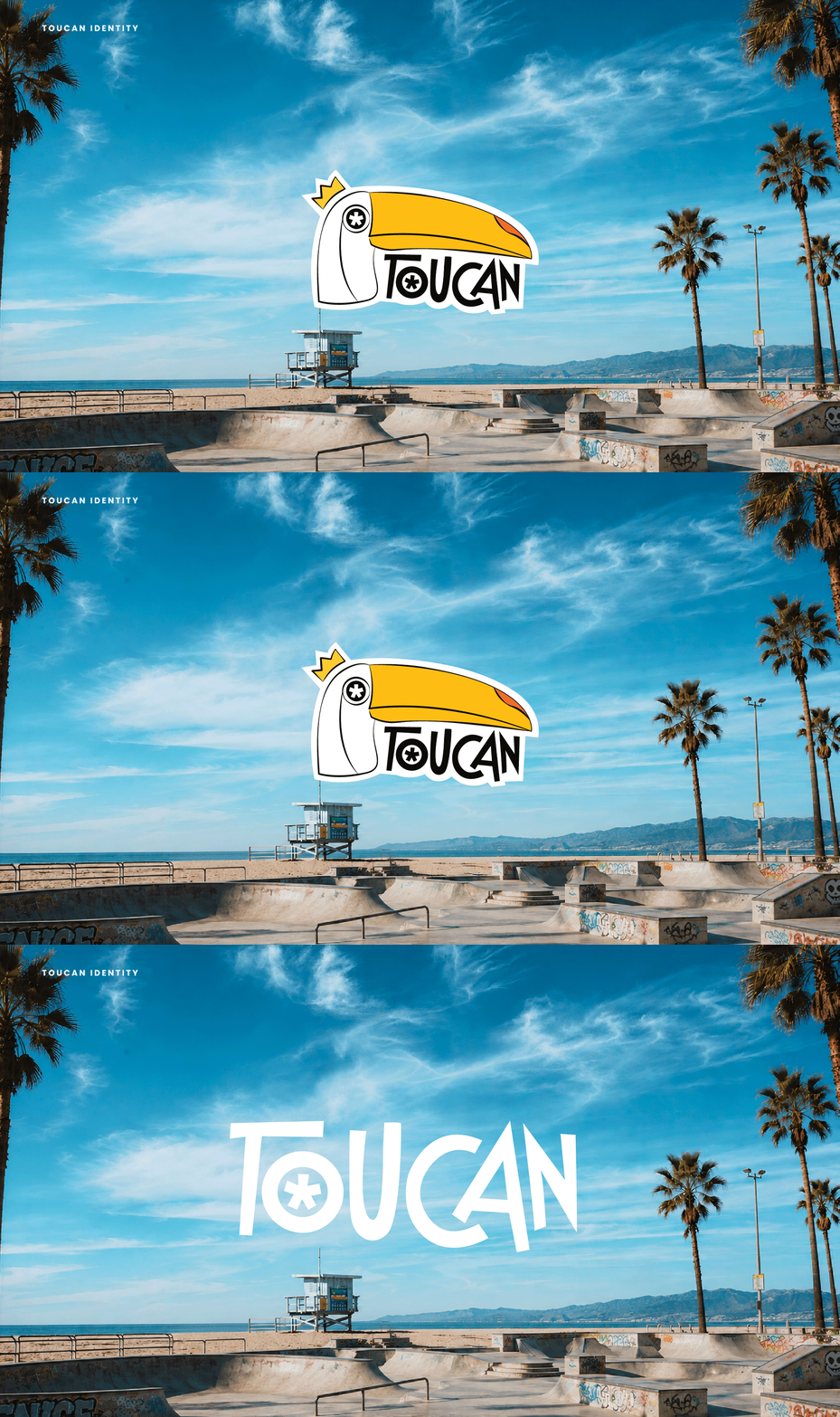
Dedicated to skateboard accessories, ranging from wheels, bearings, trucks and other essential components.
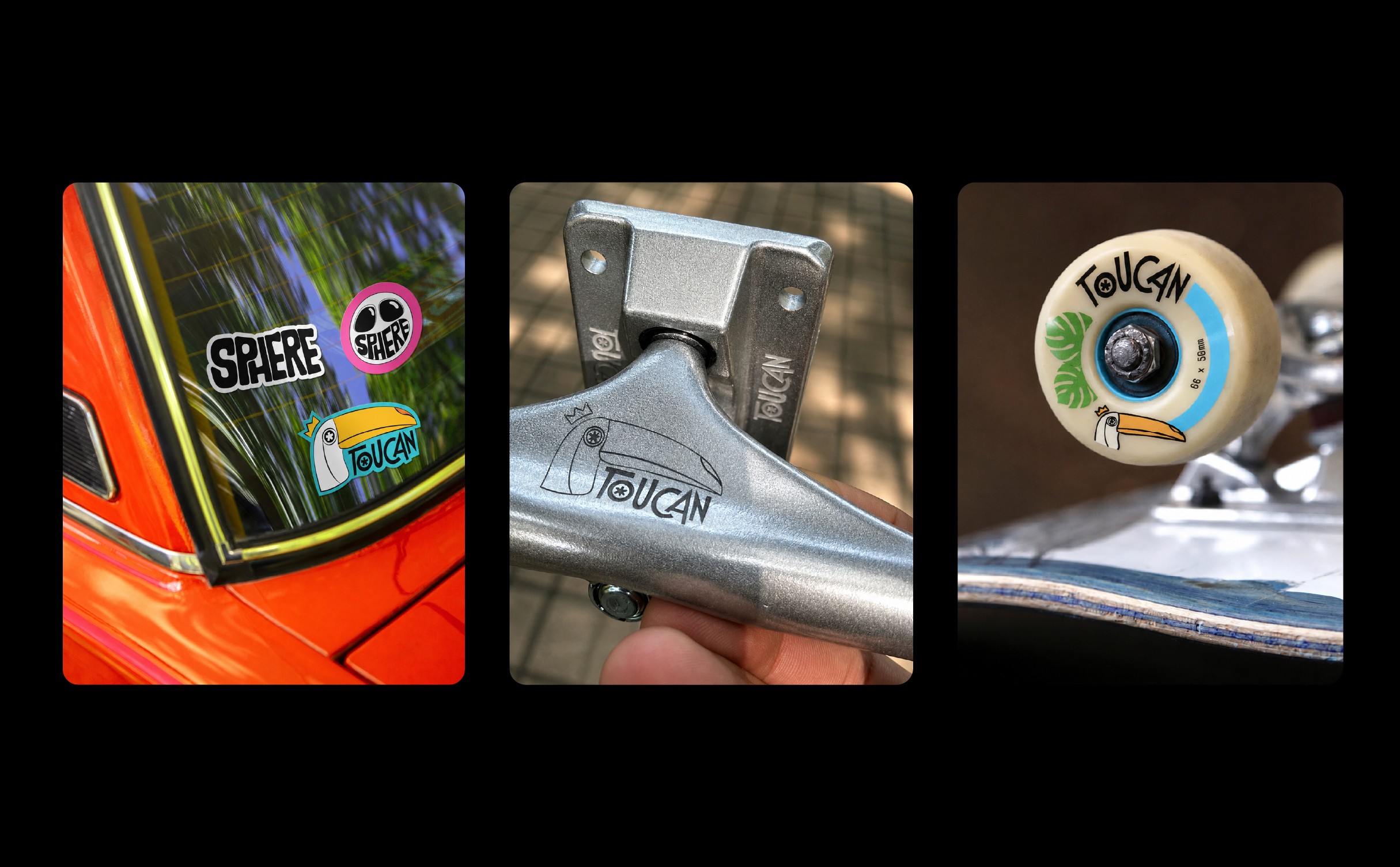
While Sphere defines the ride, Toucan powers the essentials. Together, they form a complete skateboard experience within the WeSkate universe.
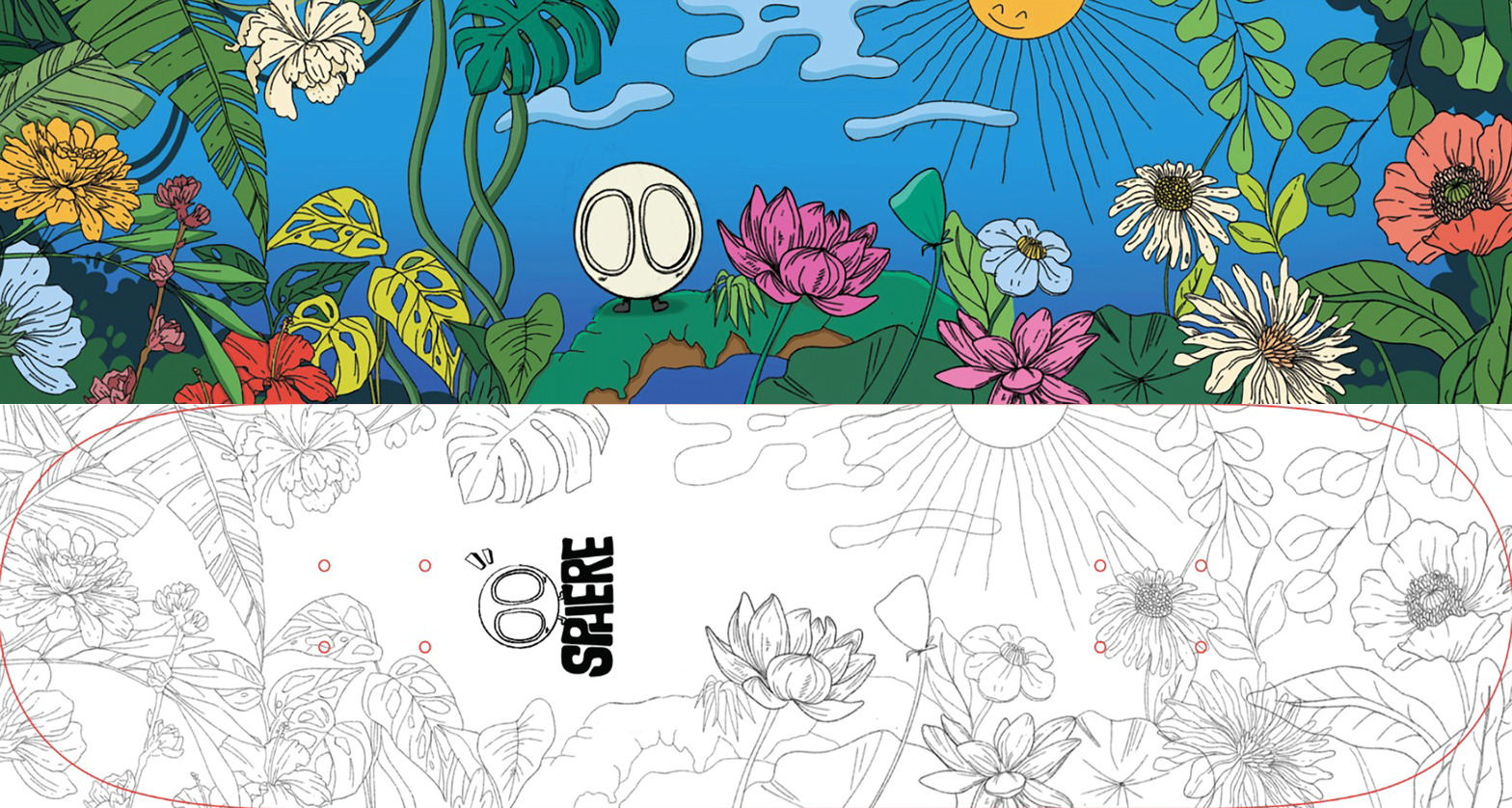
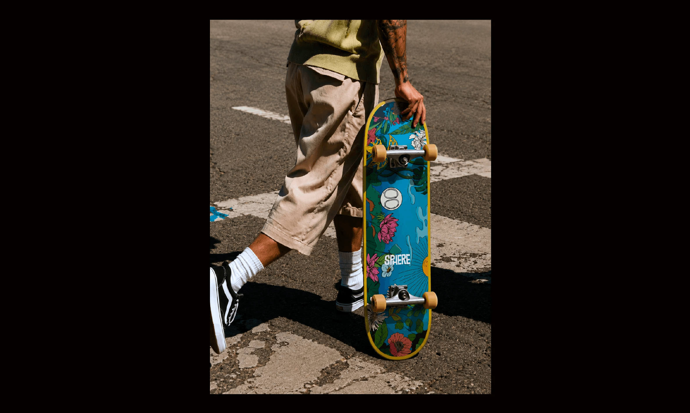
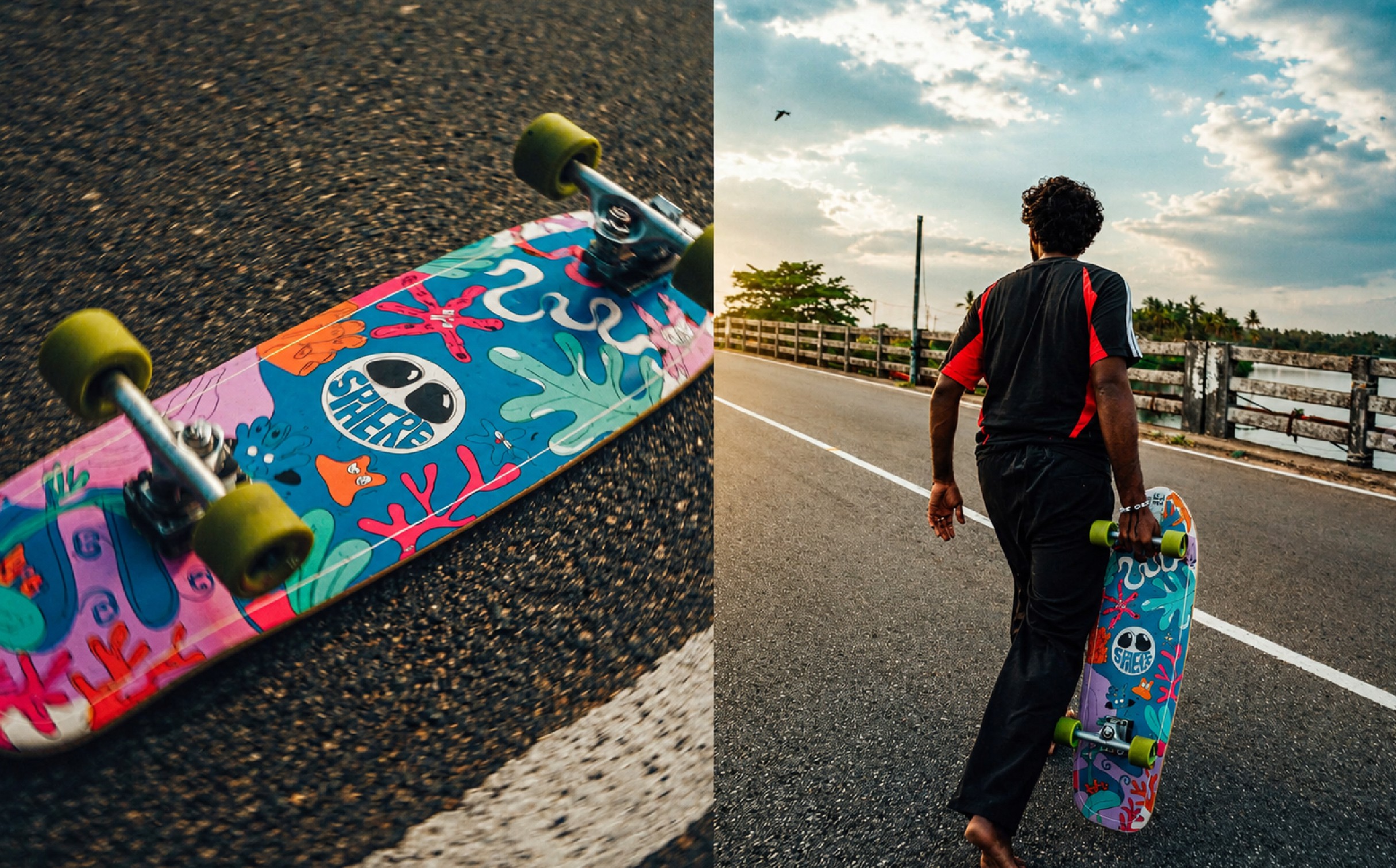
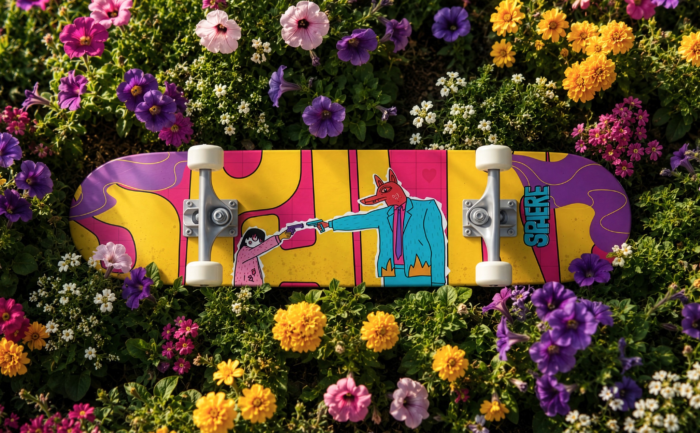
Artworks for the decks ✨


A homegrown skateboard brand built for the next generation of Indian skateboarding.
ROLE
Brand Designer
Creative Director
Client: WeSkateCo
Industry: Sport
To support this vision, Sphere was introduced as a dedicated skateboard deck brand.
More than just a product line, Sphere was envisioned as a brand with its own identity, personality, and community appeal while remaining connected to the larger WeSkateCo ecosystem.
The challenge was to create a brand that felt energetic, expressive, and deeply rooted in skate culture while giving it a distinct voice that could resonate with both new and experienced skaters.
Sphere needed to exist in a difficult space.
It had to feel authentic to core skateboarders while remaining approachable for people entering the sport.
It had to stand confidently beside international skate brands while staying rooted in the local scene.
And most importantly:
It needed to feel like a skate brand first and a product brand second.
I led the brand identity design for Sphere.
My role involved defining how the brand should look, feel, and communicate across every touchpoint—from the logo and visual language to skateboard deck graphics and merchandise applications.
This included creating a flexible visual system, developing deck graphic concepts, establishing brand guidelines, and building a scalable identity that could grow alongside the skateboarding community.
The strongest skate brands don't sell products.
They sell belonging.
People remember:
The sticker on their first board
The deck graphic they obsessed over
The crew they skate with
The videos they grew up watching
The culture surrounding the sport
The product matters.
The culture matters more.
I explored several directions inspired by motion, progression, circular forms, and skate culture.
As the brand language evolved, it naturally expanded into a broader ecosystem under the WeSkate universe.
Toucan was introduced as a dedicated line of skateboard accessories, extending the same design philosophy into the essential components that complete every ride.
Dedicated to skateboard accessories, ranging from wheels, bearings, trucks and other essential components.
While Sphere defines the ride, Toucan powers the essentials. Together, they form a complete skateboard experience within the WeSkate universe.
Artworks for the decks ✨
A homegrown skateboard brand built for the next generation of Indian skateboarding.
ROLE
Brand Designer
Creative Director
Client: WeSkateCo
Industry: Sport
To support this vision, Sphere was introduced as a dedicated skateboard deck brand.
More than just a product line, Sphere was envisioned as a brand with its own identity, personality, and community appeal while remaining connected to the larger WeSkateCo ecosystem.
The challenge was to create a brand that felt energetic, expressive, and deeply rooted in skate culture while giving it a distinct voice that could resonate with both new and experienced skaters.
Sphere needed to exist in a difficult space.
It had to feel authentic to core skateboarders while remaining approachable for people entering the sport.
It had to stand confidently beside international skate brands while staying rooted in the local scene.
And most importantly:
It needed to feel like a skate brand first and a product brand second.
I led the brand identity design for Sphere.
My role involved defining how the brand should look, feel, and communicate across every touchpoint—from the logo and visual language to skateboard deck graphics and merchandise applications.
This included creating a flexible visual system, developing deck graphic concepts, establishing brand guidelines, and building a scalable identity that could grow alongside the skateboarding community.
The strongest skate brands don't sell products.
They sell belonging.
People remember:
The sticker on their first board
The deck graphic they obsessed over
The crew they skate with
The videos they grew up watching
The culture surrounding the sport
The product matters.
The culture matters more.
I explored several directions inspired by motion, progression, circular forms, and skate culture.
As the brand language evolved, it naturally expanded into a broader ecosystem under the WeSkate universe.
Toucan was introduced as a dedicated line of skateboard accessories, extending the same design philosophy into the essential components that complete every ride.
Dedicated to skateboard accessories, ranging from wheels, bearings, trucks and other essential components.
While Sphere defines the ride, Toucan powers the essentials. Together, they form a complete skateboard experience within the WeSkate universe.
Artworks for the decks ✨