Beautiful Homes by Asian Paints

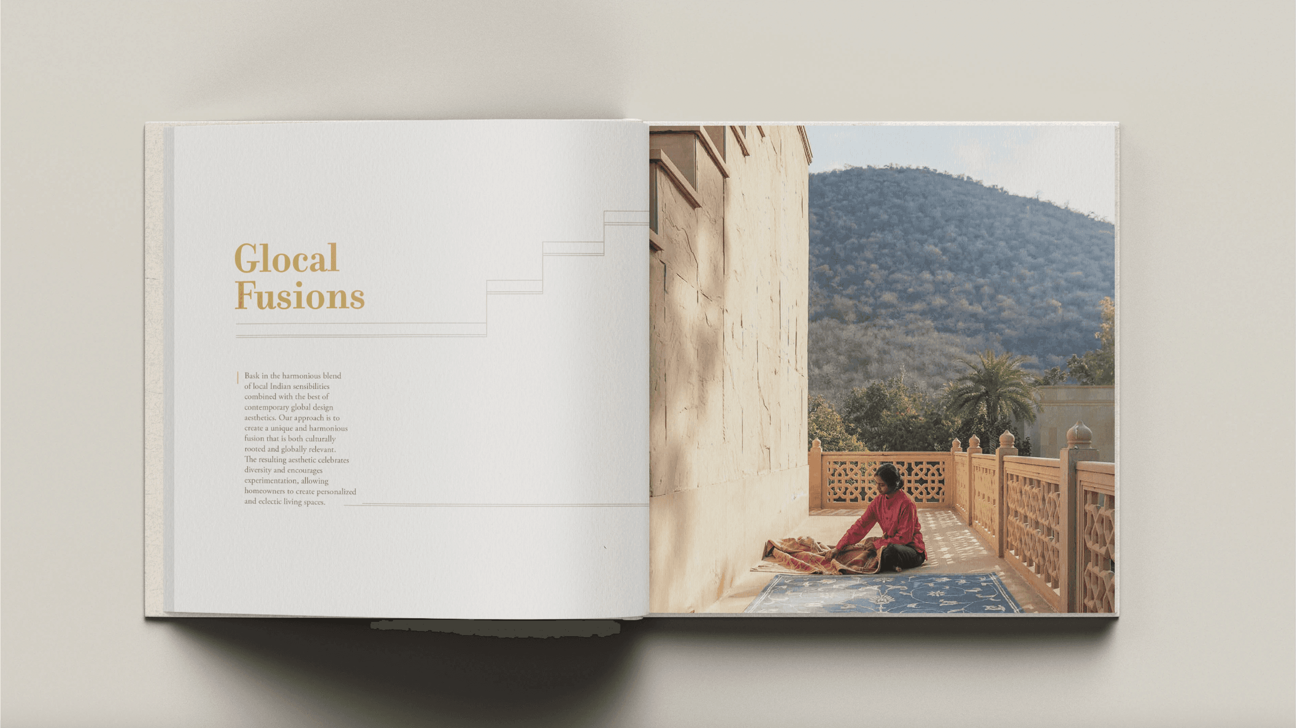
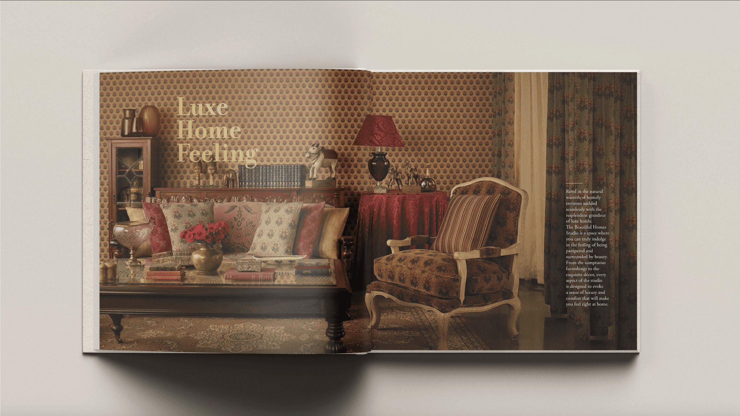
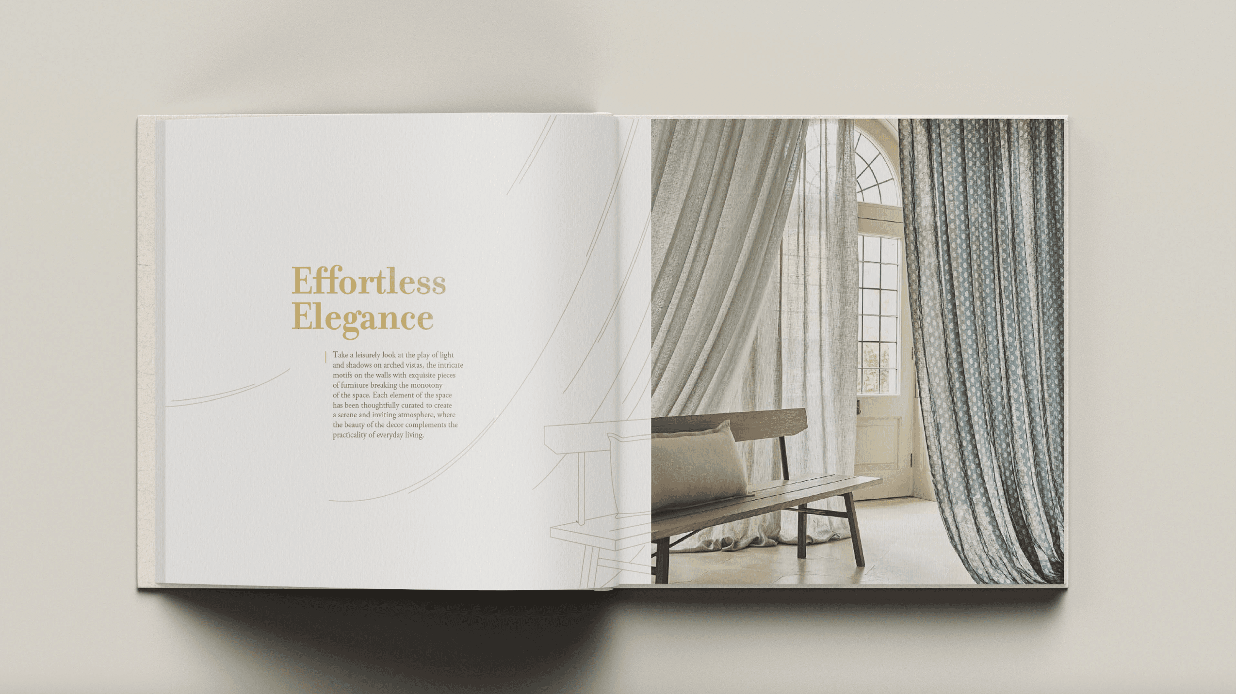
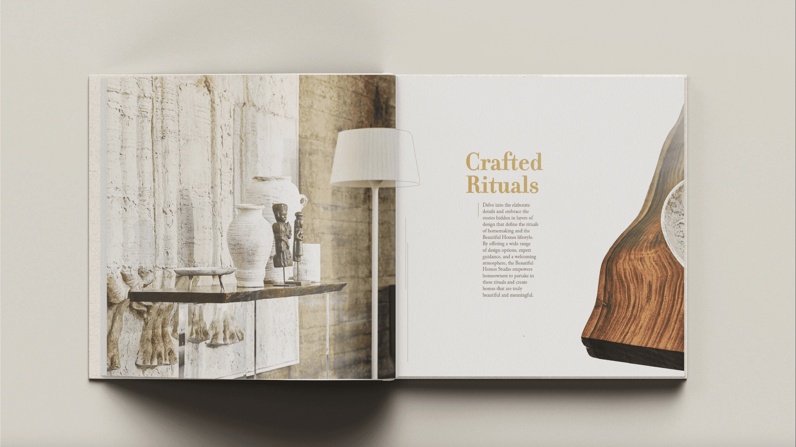
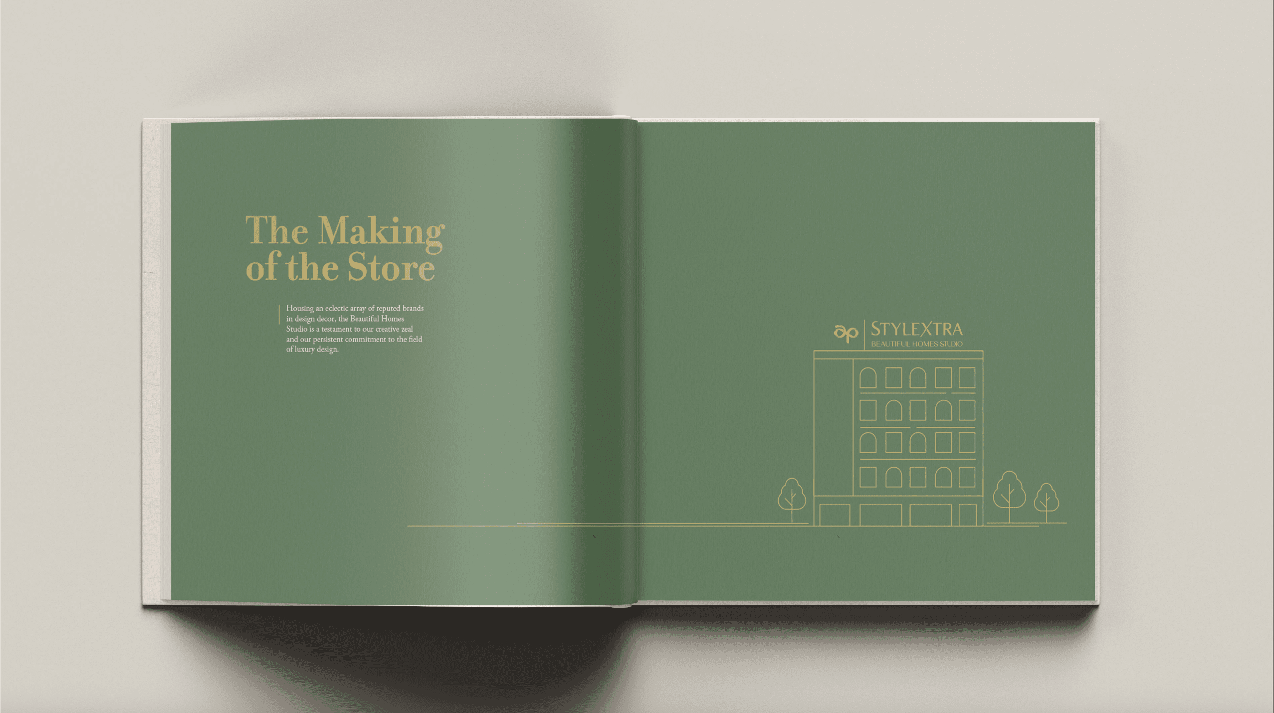
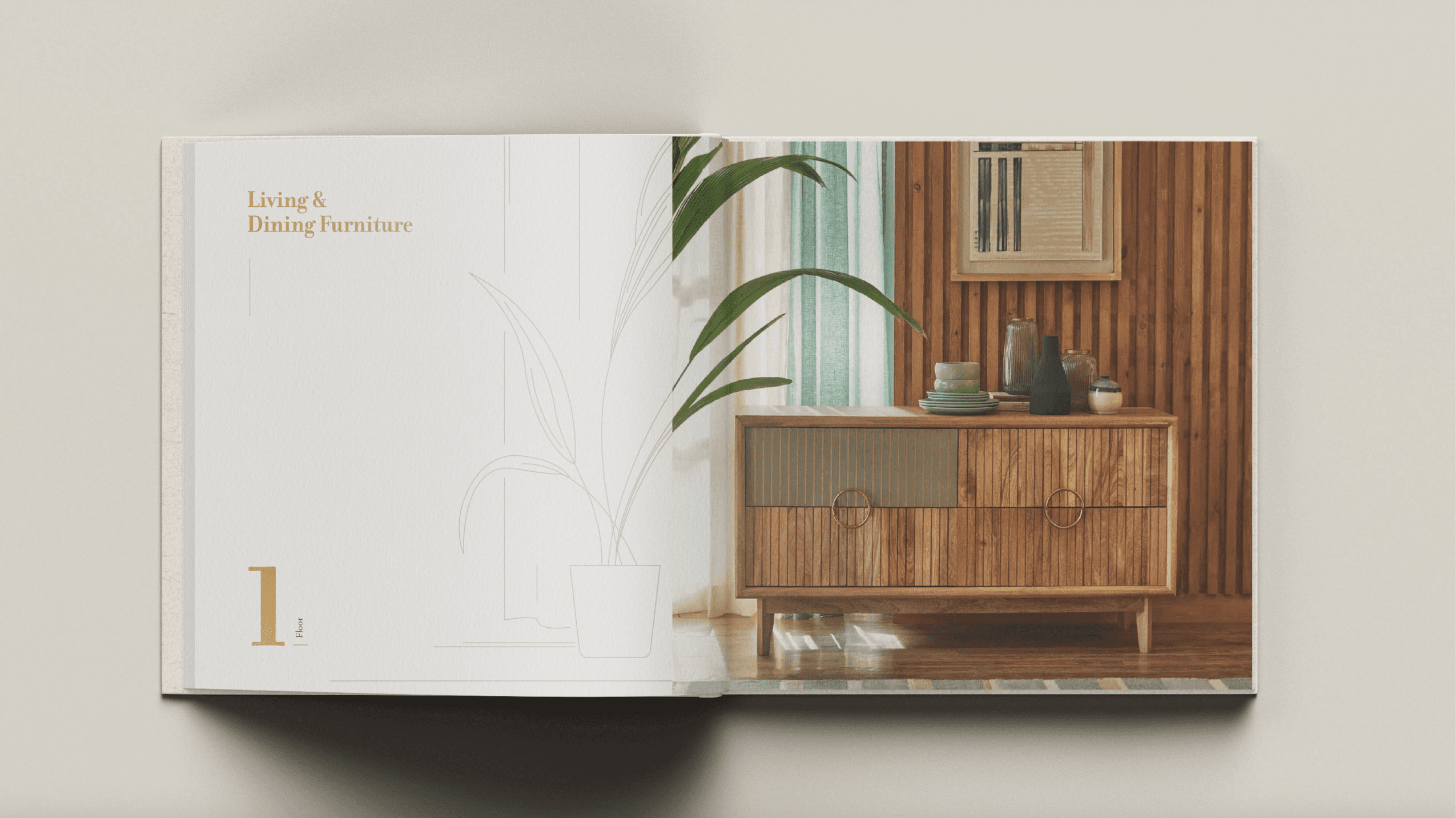
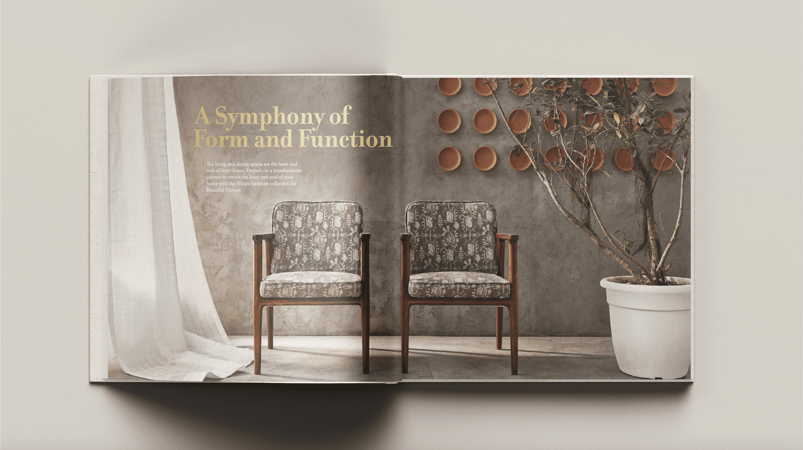
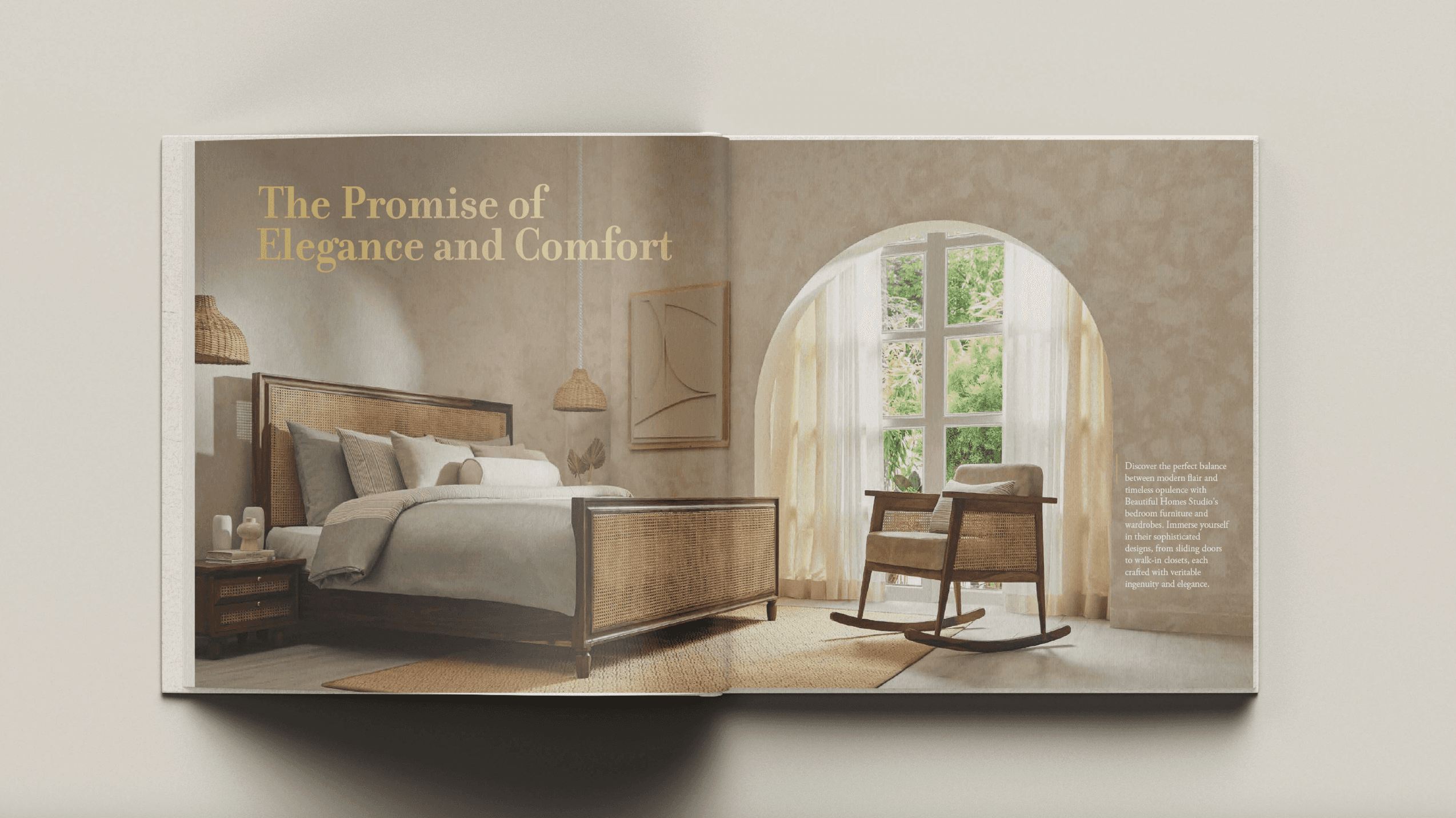
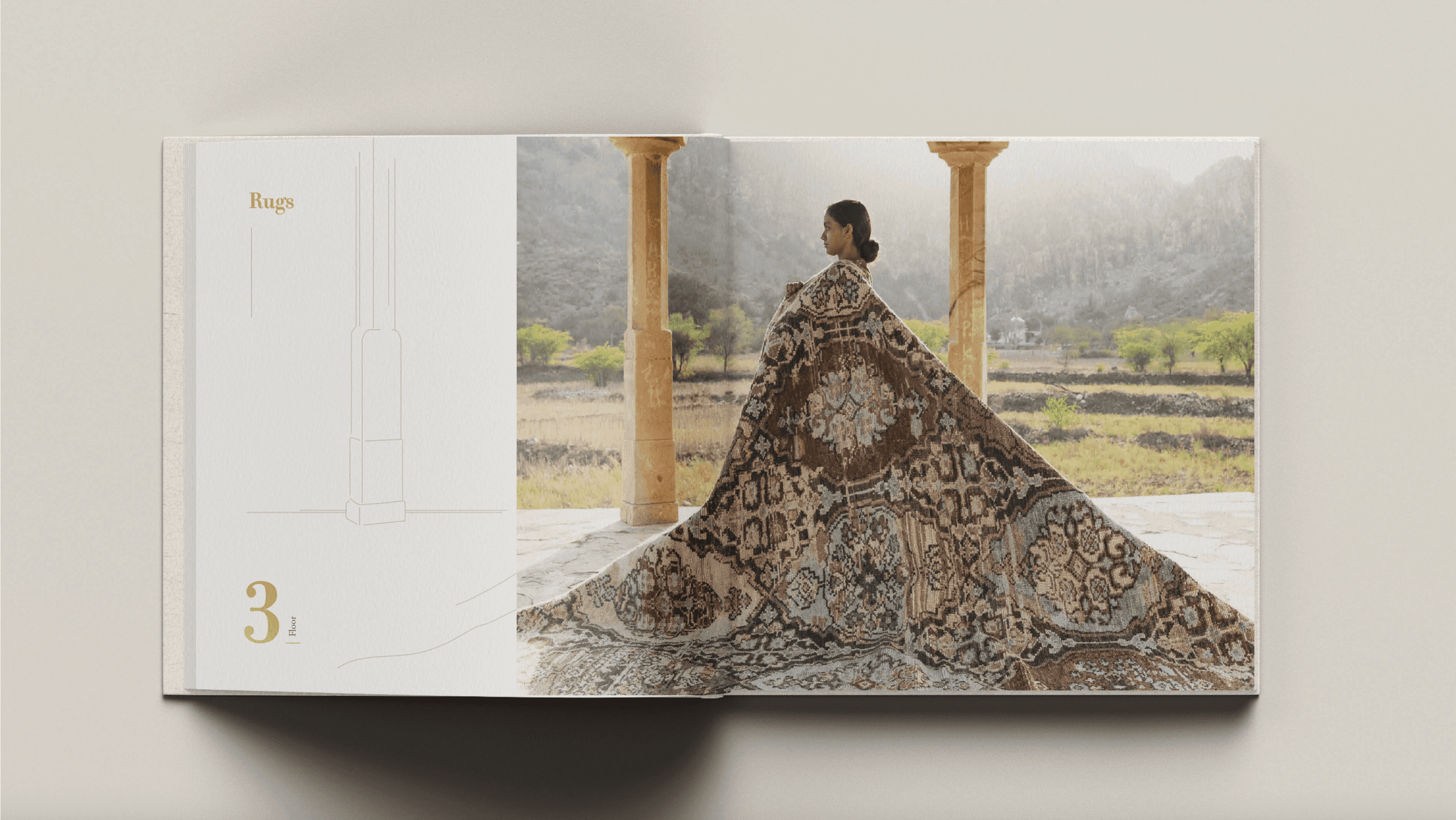
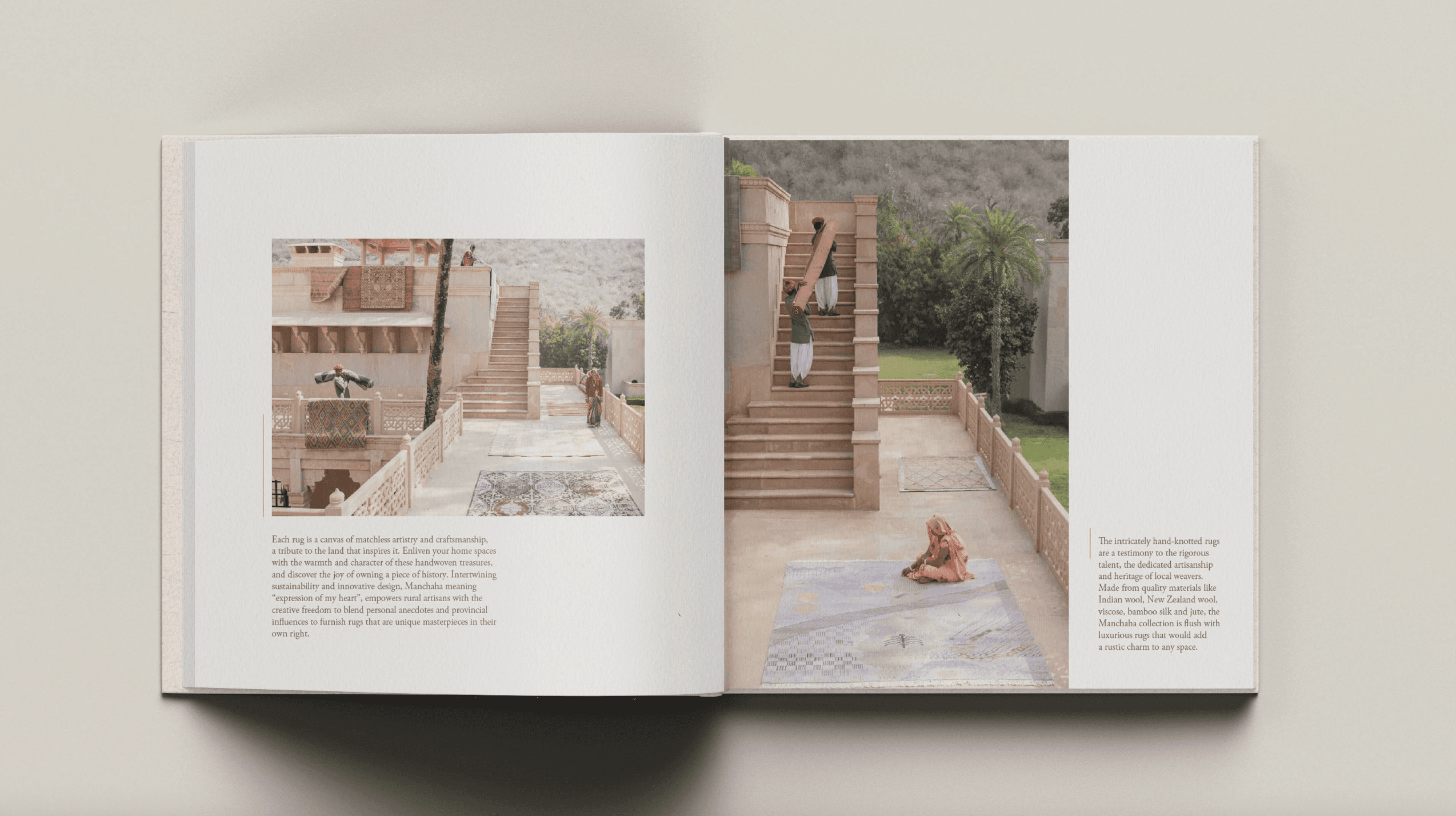
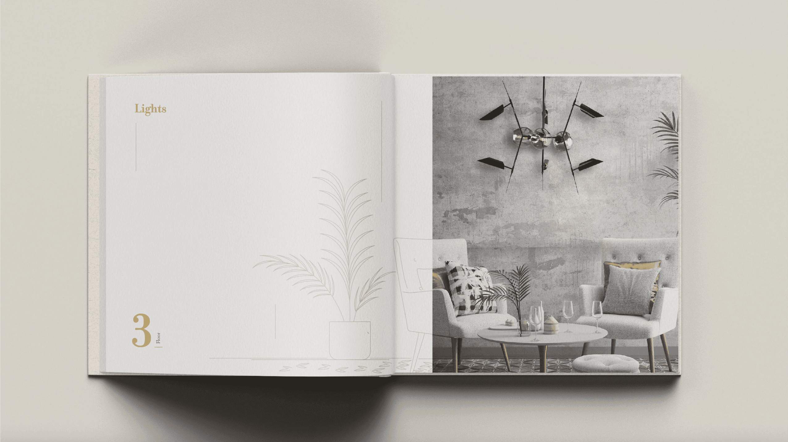
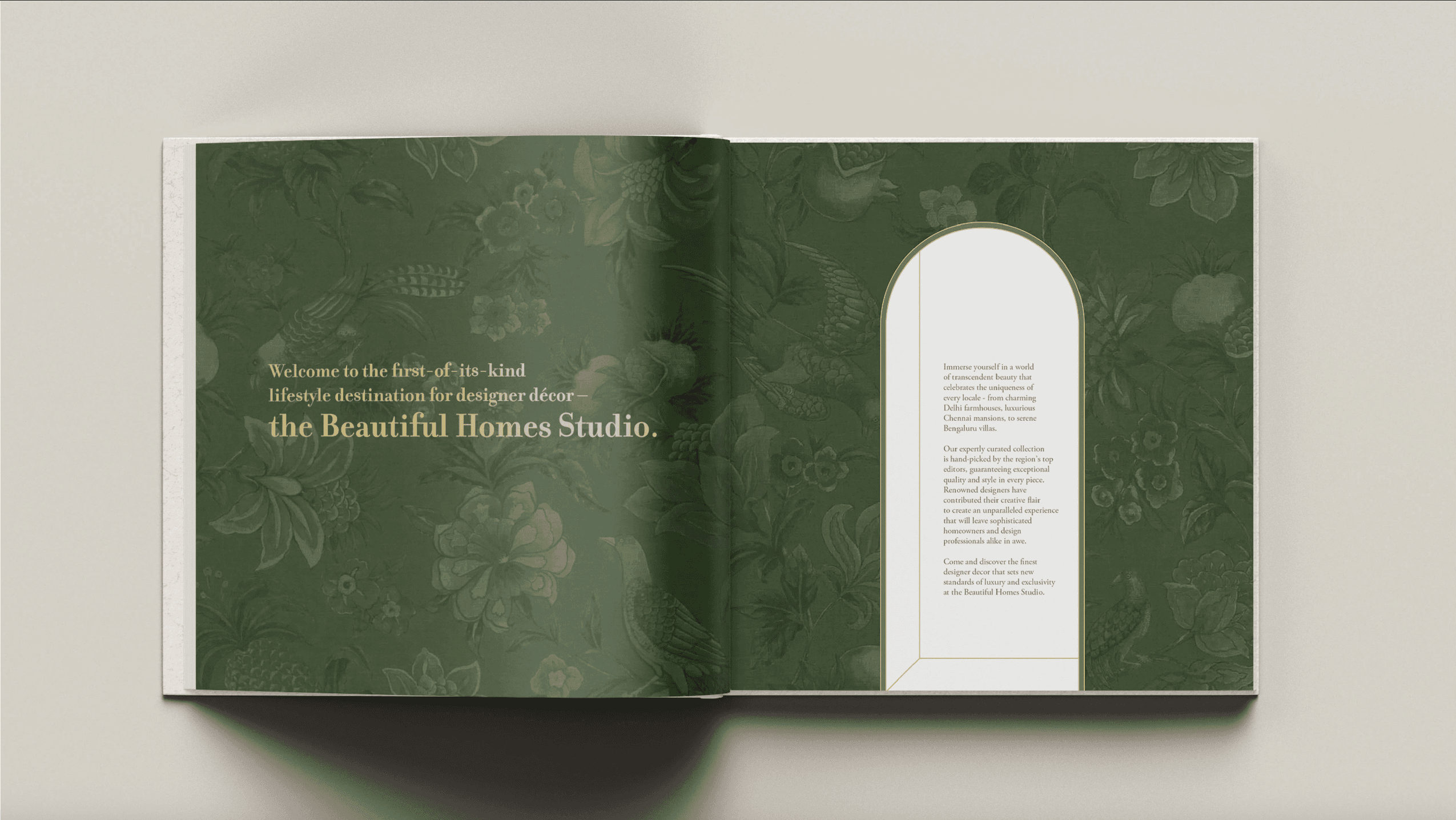
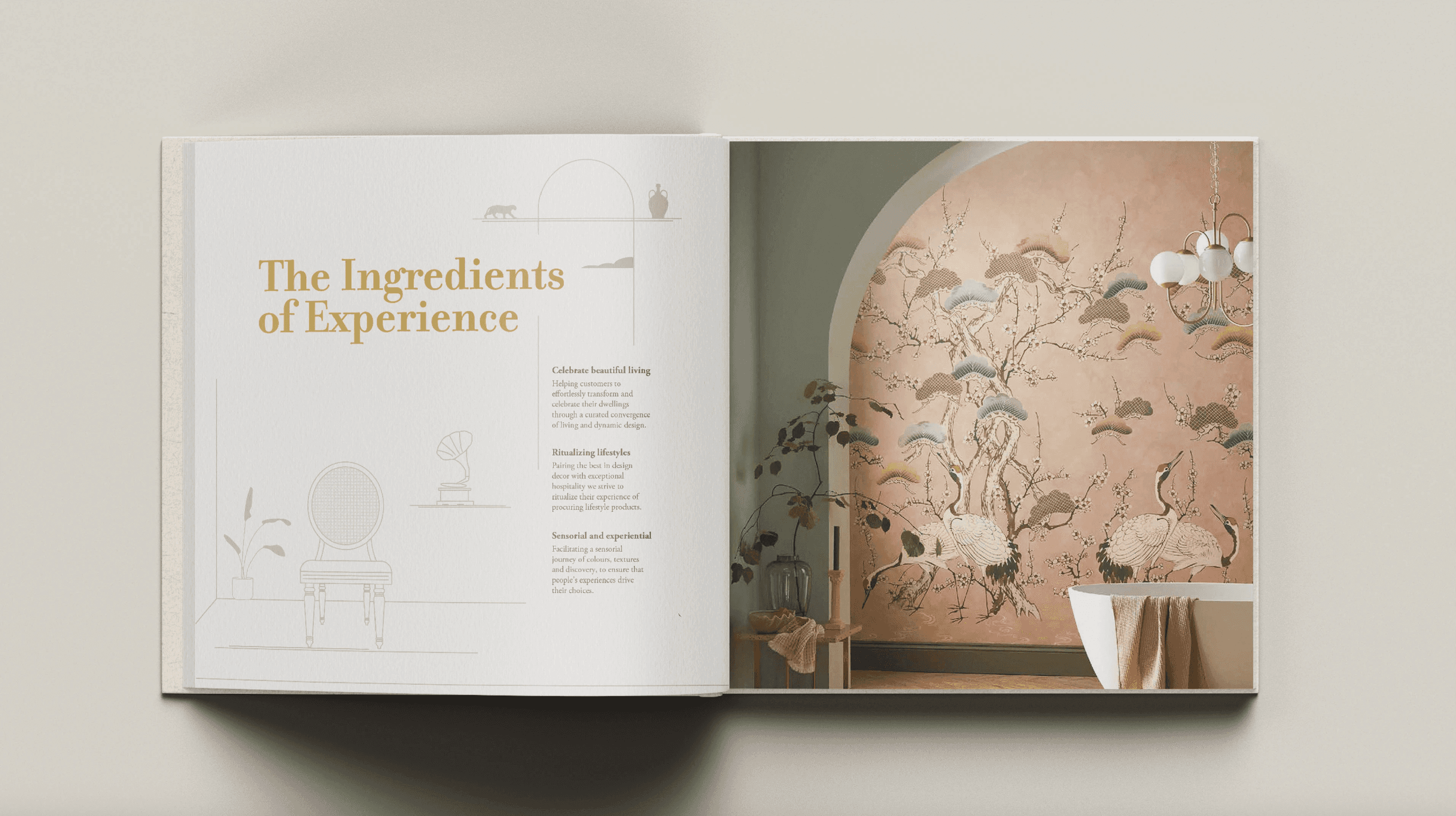
When Asian Paints opened their Beautiful Homes Studio in Chennai, they wanted a coffee table book that could capture the feeling of walking through the space. The idea wasn't just to showcase products, but to create something that reflected the experience of being there.

A laptop with a h32 word on it.

ROLE

Art Direction & Editorial Design

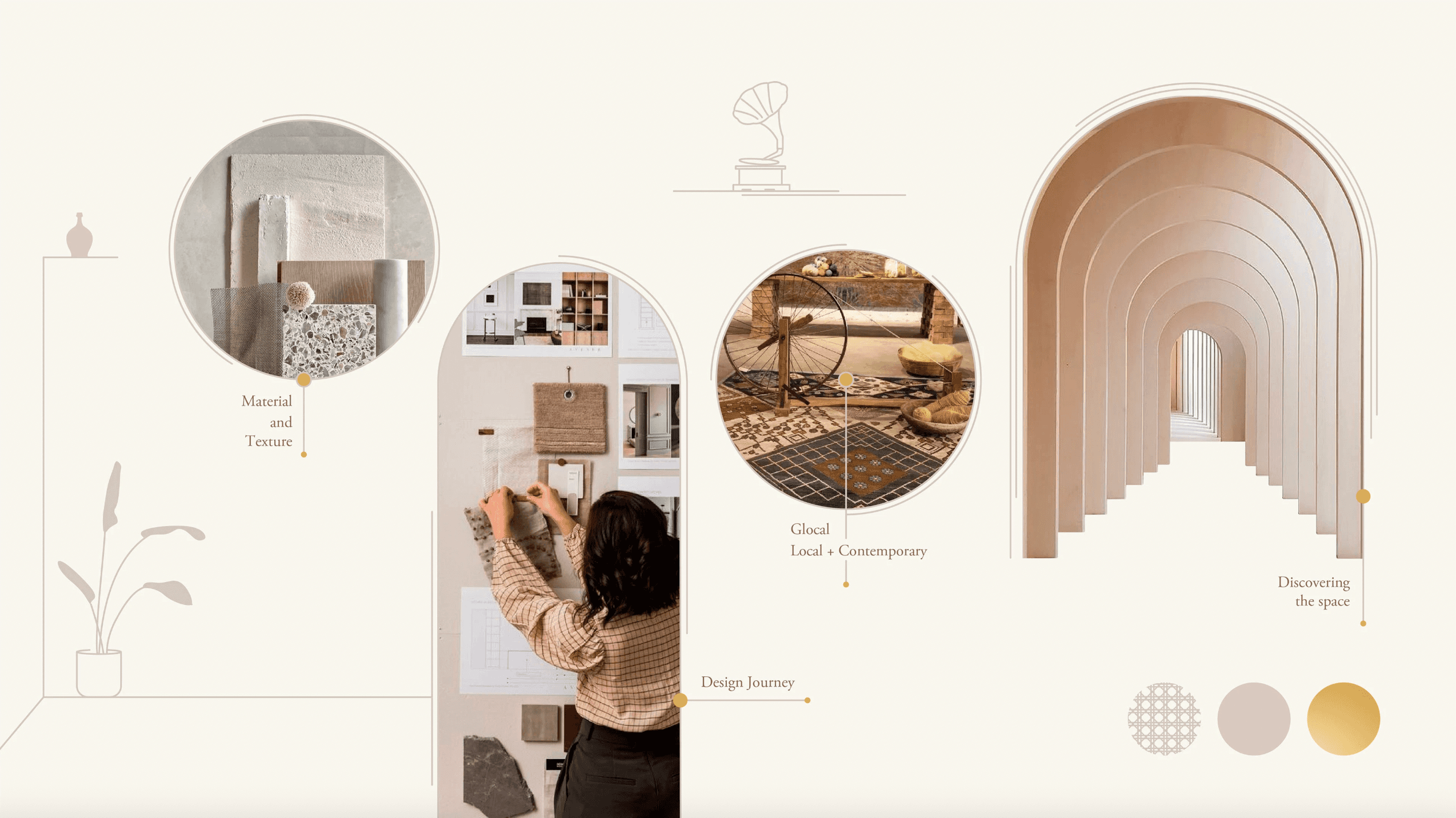
A lot of the visual language came directly from the space. I drew inspiration from its architecture, textures, and design elements to create graphic motifs that subtly tied the publication back to the studio. This helped the book feel connected to the environment it was documenting, rather than simply featuring it.

The result is a publication that feels tactile, elegant, and true to the Beautiful Homes experience, something that readers can browse, revisit, and enjoy long after they've left the studio.

Beautiful Homes by Asian Paints

When Asian Paints opened their Beautiful Homes Studio in Chennai, they wanted a coffee table book that could capture the feeling of walking through the space. The idea wasn't just to showcase products, but to create something that reflected the experience of being there.
A laptop with a h32 word on it.

ROLE

Art Direction & Editorial Design

A lot of the visual language came directly from the space. I drew inspiration from its architecture, textures, and design elements to create graphic motifs that subtly tied the publication back to the studio. This helped the book feel connected to the environment it was documenting, rather than simply featuring it.

The result is a publication that feels tactile, elegant, and true to the Beautiful Homes experience, something that readers can browse, revisit, and enjoy long after they've left the studio.

Beautiful Homes by Asian Paints

When Asian Paints opened their Beautiful Homes Studio in Chennai, they wanted a coffee table book that could capture the feeling of walking through the space. The idea wasn't just to showcase products, but to create something that reflected the experience of being there.
A laptop with a h32 word on it.

ROLE

Art Direction & Editorial Design

A lot of the visual language came directly from the space. I drew inspiration from its architecture, textures, and design elements to create graphic motifs that subtly tied the publication back to the studio. This helped the book feel connected to the environment it was documenting, rather than simply featuring it.

The result is a publication that feels tactile, elegant, and true to the Beautiful Homes experience, something that readers can browse, revisit, and enjoy long after they've left the studio.